Sunday, June 29, 2008
The Problem with Gardening Books
Most of the books focus on the former. Gardens are entities in and of themselves. They should "relate" to the house, no doubt, but no one, not even when discussing the front yard says "the house is the focal point" of the landscape. And yet, isn't it? At least when you view it from outside.
The house has volume and space, it has forms and lines. Should that volume be reduced or enhanced by your design? Should the lines be softened or emphasised? It all depends, of course, on the type of house.
One concept that has ignited my enthusiasm is the idea of "enframing" the house. When garden books talk about "framing" they are talking about framing a view, or a focal point and almost never the house itself. The concept is instantly clear in this photo (which I stole from one of the threads at the Garden Forum.)
I have been advised that my plan is too boxy and that I need curves, that I am too inexperienced with gardening and plants to worry about design issues at this stage, and that I ought not to fight the "just off" symmetry of the house, but go with something asymmetrical, like a deciduous tree with perennial underplantings and a shrub or two on the left side of the house.
No matter. I am going to persist with the planning until I'm confident enough in the design to begin planting.
Friday, June 27, 2008
I Have A(nother) Plan.
I'm not sure if it is a good plan: but it is a plan.*
Let me walk you through it.
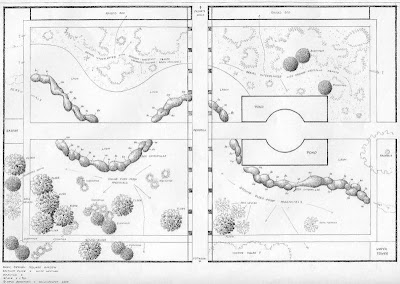
My front steps are six feet wide, so I used modules in multiples of three to come up with this plan.
The property extends six feet from the east side of the house (right) and nine feet from the west (left). That's where I want to put in a four or five foot picket fence to enclose the area. The fence will continue across the front--set back from the city's sidewalk by six feet.
Immediately inside the fence is a six foot area for shrubs. Possible candidates include Dogwood, Ninebark, and a species of Honeysuckle hardy in my zone (there's only one).
Then, we have a lawn twelve feet deep on either side. The west side looks a little barren--but that's where the neighbour's Birch is--and she often floods that part of the lawn when she waters it. On the east side I may plant a few tall columnar conifers (only 12 ft high) or I may not. I'm not sure I really want that much more shade. The little circle in the lower left hand corner is the flag pole. It needs something to balance it--and we need a focal point at each end of these stretches of lawn. A birdbath, for sure, but I'm not sure what else.
Bordering these lawns is another 6 foot planting bed.
Then, we have the paths leading to the sides of the house. We have to have the one on the west side for the meter reader and we cut across the lawn, now, to get to the backyard. So, we would use the one on the east! I wanted to hide the paths, that's why there's a bed in front of them. I was thinking of putting a few grasses in this.
Behind the beds and in front of the windows is a bed nine feet deep. Nine feet! I've read that the first 18" around the house is a "no plant" zone to ensure proper drainage. This area is for perrenials.
The question is: if I go with this plan (and I may not, depends what you all think) what to do first? There's 122 feet of fence on that plan. It'll take a miracle (and those trees coming down) before it gets done. Notice, too, I've realigned the walk. Assume that doesn't get done until next year, too--and what's left?
Breaking up concrete and preparing the soil. This year, we could break up the little walk already on the east side. Could we lay the gravel for the east-west paths before taking down the trees--or would it just get messed up? Then I could get the beds on either side ready. Actually taking a year or so to remove the grass and amend the soil isn't such a bad idea...but which area should I do first? The most important (to me) is the one by the house: but that needs the trees gone. The second most important would be the ones out by the "new" fence--and I can do them without the fence being installed (but I should wait to plant anything). That'll be hard work. There are rail road ties in there (or something similiar) which need to be dug out--and all the plants in it re-located. I have plants in there I've never seen before! Have I shown you this? It's odd. It goes the full length of the property to the west, but there's just a little stump of it to the east where the tulips came up. This was taken last month. I'd post one more recent, but it's dark outside. (I may update it tomorrow).
Advice?
Comments?
Is it OK?
I do not have the ability to "see" this in perspective. I'm afraid that the bed in front of the east-west path will just look weird--from both sides.
oh--and to refresh your memory: we're still living with this:
*I tried putting in a circle where the paths met, but it wound up "taking over." As well, the centre line of the house is the left hand edge of the pathway. Making a "curve" or side stepping the path to "line up" also went wonky on me, but I may be still willing to try it.
Tuesday, June 24, 2008
Applying "Pattern Language" to the Front Path
I selected these images from flickr keeping Alexander's edicts in mind. There really weren't that many good examples--I had to reduce the mosaic from 12 to 9 when I got to something like page 17!
Analysis:
Lessons taken:
Build the fence. They will come.
Put something high --a tree--a tall shrub out to one side to create the change in light (though that may not be strictly necessary until my neighbour's Birch dies). If I do that, I can put up an arbour over the front gate to "frame" the view of the front door and invite folks into the "inner sanctum."
Put a circle in the path--have my paths to the sides of the house radiate out from it.
Just some food for thought.
Credits: 1. The Front path, 2. Garden Path, 3. Front path, 4. Property - Front garden and path, 5. Flagstone Path., 6. green steps, 7. Garden in Slaughter, 8. Aunt's House: Front Lawn, 9. TH - good taste frontage
Foundation Planting is Not Gardening!*
Apparently, they wanted to create "open and democratic" front yards, as opposed to the English and European model of a hedged, private (and presumably elite) front garden.
The idea was popularized by Frank Waugh in a book called Foundation Planting in 1927.
This way of planting represents a different relationship with nature than one we have now, writes Hayward, the author of this historical tid-bit. Then, we had "dominion" over nature, (blah, blah, blah.) Now we see nature as endangered (because of our action) and "look to it as a model for our own." Gardens, too, are now a form of self-expression.
I don't know about all that. But it is interesting that foundation plantings (or the "open" suburban front yard) had its origins in an ideology. It's a great reminder that design always serves a purpose. It's not to be focused on for its own sake, it's not about ego as one of my favourite design books says. (Unlike, say, art.)
So what should a front garden do? What is its purpose? Hayward quotes Christopher Alexander's Pattern Language. It is to:
How?
--a change of light
--a change of direction
--a change of surface
--a change of level (perhaps with a gateway which makes a change of enclosure)
--and, above all, a change of view
That seems to be asking an awful lot of a simple entry way path, but it's interesting nonetheless. And inspiring.
*from: Your House, Your Garden, by Gordon Hayward. P. 27
Monday, June 23, 2008
Needing Sympathy
Well, no, it isn't trees, of course. It's money. Of course. I am wistfully envious of people like Lorijo who likely work very hard to have bargains seemingly fall into their laps--it's a gift and I don't have it, nor do I know how to get it.
The estimate for chopping down the two trees and the shrub into firewood sized pieces is $398.00. Grinding the three stumps: $198.00 Now, I'm thinking I need to call them back and say, "Hey, we want to feed the remains into the wood chipper for mulch, we don't need firewood". Perhaps that will bring the estimate out of the stratosphere? After declaring we just couldn't afford it this year (and at that price we most certainly cannot.) the husband did volunteer to "ask around at work."
I am tempted, sorely tempted, to try and do it myself. It isn't complicated, is it, Lorijo? Just trim the branches off (where do I get a ladder high enough? What sort of saw do I need?), cut a notch in the tree (where exactly? how far up the trunk?), attach a rope to the top (how thick, how long?) and pull those suckers down (with what? How much force do we need?).
What price a dream?
On a more positive note, this afternoon I cleared out this area of Mountain Ash suckers and Raspberry canes (a "gift" from our neighbour):
It sure doesn't look like this now. And the lilac has stopped blooming. I pruned it today.
I found these:
What should I do with them? (There's a few more in there, but I ran out of strength.)
Hello...Goodbye
It's a May Day tree. Prunus Padus. And it has Black Knot disease. Can't be saved. Can't be helped.* I can enjoy it for a few more years and then it will be dead...and we can pull it down then. Cost to remove: $326.00 Stump Grinding: $125.
(sob)
*My internet research bears this out. The amount of pruning it would require would likely kill it and even then you haven't "got" it all--infected branches can spread the disease up to 2 years before it's even visible. The tree is suseptible to it and it is better avoided than treated.
Commonly Uncommon: The Meme.
1. What is your first name?
2. What is your favorite food?
3. What high school did you go to?
4. What is your favorite color?
5. Who is your celebrity crush?
6. Favorite drink?
7. Dream vacation?
8. Favorite dessert?
9. What do you want to be when you grow up?
10. What do you love most in life?
11. One word to describe you.
12. Your flickr name.
1. Alana, 2. Chocolates Nuts Sandwiches, 3. Berenice, 4. La Chartreuse, 5. Sean Bean in York, 6. a cold morning, 7. happiness is.. driving a caterpillar truck, 8. Double Chocolate Cheesecake, 9. Cliffhanger, 10. Romans 12:1, Painting with Light Art *, 11. hair, 12. thursday love
Happy hunting!
Sunday, June 22, 2008
Opinions, Please.
Sorry about the picture quality: it's my photo of the house "doctored" with MS Paint, printed and then rescanned with the little plants on it.
We have from left to right:
Cost--not on my price list, but a similiar tree is about $100.00 so let's say that.
On the right, under the dining room window, another Annabelle Hydrangea and a Little Giant. (I may not actually have room for both.)
Total cost: $280.00 (And there be my budget for this year.)
(I really have to tone down that front door, now!)
Questions:
1. The tall conifer may not be dark enough. My second choice is Rocky Mountain Juniper 'Medora' with blue-green foliage, but it only grows up to 10 feet tall (about the height of the windows) and it is leggy (up to 2 feet). Is it OK there--or is the balance of the facade tipped over to far? Egads, maybe it isn't big enough?
2. What does Hydrangea look like in the winter? Will it grow in the smaller second location which is extremely shady? (Though I won't know exactly how shady it really is until the shaggy trees are removed.) At 4 feet, is it too low? (The windows start at 5 feet from the ground). What should I plant in front of it? (It's leggy).
3. What do you think? Honestly?
GT Week 4: Your Tasks
What you should have done by now:
So, moving on to this week's tasks.
Bones:
Breath:
Heart:
Head:
This last thing is inspired a bit by scb's newly discovered affection for glue sticks, but I did read it in a landscape planning book, so I'll pass it along.
1. Take a picture of your current landscape.
2. Modify it if you need to to delete plants you no longer want or which will be relocated.
3. Take pictures of the plants you do want and re-size them to be more or less in scale with your photograph. (Use a photocopier or software.)
4. Arrange the pictures of your plants on your photograph in a pleasing way.
5. Bring this with you when you shop for plants.
Saturday, June 21, 2008
Garden Therapy, Week 4: Texture
It's one of the tools in the Garden Artist's wheelbarrow. I have no idea what the effect of using only fine and delicate plants in a garden would be--a fairyland? But, like anything else, any feature is best appreciated when set against its opposite. Contrasting the textures of plants in a composition amplifies each one. But manipulating texture not only creates pleasing and interesting contrasts, but you can also use it to create illusions of depth and perspective.
Detecting a plant's texture may be a bit of a challenge. The first thing to do is to train your eye. Often encyclopedias and design books do not mention the plant's texture. You have to see the whole plant (and not in the nursery where the "baby" plant may have a completely different texture than it will when full grown).
Nonetheless, the general idea is this: if you can see the details of the plant from 20 feet away, it is coarse. If it appears a solid mass from that distance, it is fine. Medium or average plants are somewhere in between--like a daylily. Another clue is the plant's leaves. Large, glossy, dark leaves reflect light (bold) and small, fuzzy, crinkly, leaves absorb or diffuse it (fine).
Of course, such distinctions are relative. A bleeding heart next to a flowering cabbage will look much more delicate than it would next to Snowcap wall cress.
As a place to start, Northscaping provides a description of the plant's texture. Here is a collection of plants* which Northscaping classifies as fine:
1. Dwarf Korean Meadow Rue, 2. English Cowslip, 3. Blue Heaven Bluestem, 4. Shi-un Primrose, 5. Northern Maiden Head Fern, 6. Pink Creeping Baby's Breath, (The Mosaic somehow lost these images: 7. Medora Rocky Mountain Juniper, 8. Snowcap Wall Cress, 9. Blue Arrow Eastern Red Cedar.)
Here's a collection of medium coarse to coarse plants:
1. Bressingham White Bergenia, 2. Limelight Hydrangea, 3. Bloodroot
4. Giant Lamb's Ears, 5. Frosty Morn Stonecrop, 6. White Bee Balm,
7. Aureomarginata Plantain Lily, 8. Pink Lights Azalea, 9. Diablo Ninebark.
Designing with Texture:
Consider the texture of the walls of your house or fence. Place a bold plant against smooth vinyl siding, or stucco for example, or an airy and lacy plant against rough stone or brick.
Without air and light to pass through it, a tightly clipped, dense, dark green hedging will make an area look smaller. On the other hand, loose light deciduous shrubs like spirea and rosa rugosa can create depth and thus make an area appear larger.
The eye is attracted to dense, bold foliage, first. You can play with this and create perspective in your small garden. For example, placing a plant with coarse texture in the foreground is supposed to create the illusion of a larger garden as the light and airy plant is perceived as farther away and so creates the illusion of greater depth.
Even though contrast in texture is desirable, it must be handled judiciously, especially in a small garden. The predominant use of one plant or texture in a garden creates a basis against which all others are seen and measured. Everything seems bolder, or more coarse or more refined than this chief texture.** Effective in a small garden is the occasional use of a bold broad leafy plant such as flowering tobacco against the more delicate blooms of lantana, gaura and verbena.***
(I couldn't resist)
1. Flowering tobacco, 2. Verbena, 3. Gaura, 4. Lantana
1. flowering tobacco (ハナタバコ) #5759, 2. Tranquility, 3. W h i t e 3, 4. Lavender Lantana
*The mosaic tool is an excellent way to see the effect of one plant against another. I may play around with contrasting textures just to see how it looks.
**A lawn can also serve as a "texture reference" for the other plants in the garden.
***recommendation from P. Allen Smith, Garden Home, p. 124
Next: The GT Week 4 tasks, BBHH.
Friday, June 20, 2008
Garden Meme
The Questions:
1. Name a gardener, any gardener.
2. What is your favorite vegetable?
3. What well-known garden have you visited?
4. What is your favorite flower?
5. What garden would you like to visit?
6. What water-feature would you put in your garden?
7. What country epitomizes gardens for you?
8. Is there a special type of garden you would like to incorporate in your own garden?
9. Show us something that you think would make a great pattern for a flower garden.
10. What do you love most about gardens or gardening?
11. One word to describe your garden.
12. Give your garden a name.
The Answers:
Photo Credits:
1. fishnet stocking coleus, 2. Star of the kitchen, 3. frozen expression, 4. My Favorite, 5. By The Pool in Autumn, 6. Water Lily, 7. 2007 - Day 113 - This England, 8. The famous maple, 9. Levels, 10. Stay away from me weirdo !!, 11. dreams (reprise), 12. Valle fotografesh
Happy Summer Solstice
June 20, 2008
Sunrise: 5:05 MDT
Sunset: 22:07 MDT
Mermaids celebrate it.
Apparently, folks in Poland celebrate it as the Festival of Fire and Water.
But, of course, we're much more familiar with the stones. Ancient Stones standing to mark the position of the sun in the sky at the longest day of the year.
Stonehenge
If you wish to build your very own sunwheel, you can get an idea of cost from this site.
Theoretically, if you travel around the world fast enough, it's possible to see the sun set continuously. Of course, the only way to actually see the sun set is on the ground...and so we have Google Images.
(1) In the East:
Above: Phu Phek Mountain in the left side of the picture. The picture was taken from a position straight true east of Phu Phek around summer solstice 2004. The sun is setting at its northernmost position and will set at the peak of Phu Phek at equinox.
(2) To the South (where, of course, it's actually the Winter Solstice):
Krueger Nat'l Park, Africa
(3)In the Netherlands:
(4) To Leeds:
(5)A short jump to Ireland (for Colleen):
(6) and in the U.S.,
Minnesota:
(7) California:
(8) And, finally, to finish up. Alaska.
It's odd to think that summer starts as the days begin to shorten.
Gulp: I made the call
(It's the one in the foreground with all the dead branches).
And he'll give us an estimate for the cost of going from this:
To this naked thing: (minus the new paint and shutters, of course.)
Please, please let us be able to afford it this year.
What I Did on SCB's Staycation
Cut my hair
An invasion of tiny critters necessitated shearing my below-the-shoulder length hair to my ear lobes. I have no regrets.
Did Laundry.
Stalked the surrounding neighbourhoods for landscaping ideas
and plant ideas and curb appeal. Noticed lots of overgrown conifers and badly done additions. Found lots of tasteful and charming front yards, too.
Did Laundry
Expanded my latin vocabulary to include words like pinus mugo, lonicara, physocarpus, viburnum, and thuja occidentalis. Fell in and out of love with conifers. Fell in and out of love with P. Allen Smith.
Learned an amazing amount about plants--and that they cost an arm and a leg. So do fences.
Had Aurelia plant a little window box of flowers for the playhouse.
Did Laundry
Went back to school with the kids.We are almost back up to full speed with our grammar, math, spelling, history, latin and science.
Planted tomatoes.
Replanted tomatoes
Thought of renaming the dog Houdini.
He's getting free of us with amazing regularity and even with racing along with his nose to the ground, he's faster than Underdog. The great proliferation of rabbits in the neighbourhood doesn't help either.
Did Laundry
Discovered the WT Diet.
Indeed. Buy nice clothes, wear them for a month and feel great about your self and at the end of the month go buy new ones. (Though I'm not rushing out to do that just yet.) My new jeans are now floating, floating on me, people. I can pick up a fistful of fabric at each thigh and the "high" waist is now below my belly button. I think it's the pants, though. My other jeans seem to fit the way they always have.
Weekend Plans.
Thursday, June 19, 2008
Apology: I think I've been confused.
Scale
And now I know why. I have a small lot. Crazy but true. After a morning on Google, I have finally found a landscape plan drawn with measurements! It's from Taunton's excellent site on Garden Design in an article called "A Big Garden on a Small Lot". I clicked to it on impulse.
90 feet wide--90 feet is considered "small."
Good grief.
Wednesday, June 18, 2008
Week 3: GT: Shape
One of the most basic steps after determining what "rooms" your landscape will include (and what their purpose should be) is to decide what shape they ought to take. You can either begin here...or end up here, depending on which way you prefer to work.
Whichever approach you take, you will want to have done a scale drawing of the area you're working with. Here's mine:
(That dot in the lower left corner is the flag pole.)
If you want to end up with your borders, you follow these steps:
1. Find your "main view"
2. Determine your focal point.
3. Frame your focal point.
4. Determine the secondary view.
5. Repeat steps 2 and 3 above.
6. Now, arrange the focal points. Imagine each little "nest" of frames and focal points is a piece of furniture and move them around on your scale plan of the area you're working with. Your focal points will lead the eye "around the room" so make sure it doesn't lead it to anything unpleasant (like the telephone pole, or whatever.)
7. Draw a border. You can do this two ways: a) draw a loose shape, equi-distant from each focal point, or b) simply trace the outline of the frames and adjust accordingly.
When I was playing around with this approach and sketches, I came up with this:
It's a nice plan, focusing on the entryway and making the most of that wretched sidewalk. In fact, that my efforts were on the right track was confirmed by a "front entry" planting plan I came across in a book. I re-created it and looked up each plant listed in order to get a feel for the layout. I made my own colour coded sketch.
Isn't it lovely?
(Another way to use the idea of a bouquet: just turn it on its side and find plants to "fill it in." Sort of a gardening 'paint by numbers' approach.)
But note this: once the blooms fade, there is nothing, nothing interesting here at all. Even if I switched out the plantings with conifers, dogwoods and grasses, the dominant perspective changes from looking in from the street to out through the windows, and so the plan (and the approach) does not work for me.
No, because "winter interest" is almost more important in this place where we have more days of winter than any other season*, I have to start with what will be left when summer is over, and that means the framework, the out-line, viz. the shape of the garden.
So, there are triangles, as we've seen, circles, squares, and rectangles, and of course, combinations. The recommendation is to go with the shape which is the "most natural" for the space.
I toyed with circles for a long time. I love the look of a circle within a square, especially.
And then, there's the circle "wheel" which I also love:
(Not one plant is over 8" high in this planting bed.)
But here's how circles/ovals would look in my garden:
Somehow, they're all out of proportion to the space and, unfortunately, don't really "fit."
Then, there are rectangles. I'm currently working on an idea with three long rectangles crossing the house and a center ellipse.
A "transparent" fence on the bottom, (12-13 feet deep) provides a low boundary and winter interest (it's deep enough for conifers to "back" a few dogwoods). The ellipse in the center gives us a limited amount of grass to mow and provides a focal point at each end. (Making the flag pole one of the "frames" for the focal point instead of the focal point itself was last night's inspiration)
The planting bed in the third rectangle, closest to the house, gives me all the "playing" room I want (and maybe more than I want.) The only disadvantage to this extremely linear plan is our wacky, nasty, sidewalk to the house. It was very poorly done and I think we both want to replace it. (Some day.)
So, this is another way to approach designing the landscape. It gives you a few bones on which to scaffold the rest of your plantings and plans.
*according to one source, on average, we have 145 "continuous frost free days" and 225 days "outside the frost free period" i.e., winter.
Tuesday, June 17, 2008
It's A Beautiful Day in the Neighbourhood
And here I am, to bring you along, with my new haircut:
I'm not going to say much on this tour. You can just enjoy the evening. Remember, you can click any image for a larger view.
and just around the corner, in the alley, we find this:
Thanks for joining me on the walk.
Oh Dear--
After reading Zooza's and Anne's comments and feeling encouraged, I called to find out just how big that Thuja was I'd seen in the pot. Turns out it is about a foot and a half, "two feet at most"--and the helpful fellow also told me it grows into an "egg" shape--not a round shape. If I want round, I should be looking at 'Danica' or a 'Hetz Midget'. They turn into round ones. The moral of the story is still the same, though: I will have to "go slow." Small conifers grow slowly--it will take them 10 years to grow to maturity. (We may be able to afford the iron railing by then!)
Window shopping at the Nursery yesterday was an eye-opener. They want $30-50, per plant. The evergreen shrub I'm particularily interested in grows to 5 feet by 5 feet. (Thuja occidentalis, 'Little Giant') I know this isn't quite right: but that's about $10/linear foot.
See? I'm not the only one. Must have been a trend back when these houses were built, we see so many!
Where do I go from here?
I'm also becoming thoroughly discouraged at even being able to find any green "background" evergreen shrubs of a decent size (but less that 6 feet) that will grow in part shade in Zone 3. (Thuja does best in full sun and the shaggy, leggy bush in the front is a larger Thuja.)
Not sure what tack to take now.
Whimsy
No, not Dorothy's Peter (though that's what I'd call him if he were mine).
We went to a garden centre today, just to look around.
I'm full of ideas and absolutely in love with burgundy and chartreuse.
(Ninebark)