Showing posts with label style file. Show all posts

Wednesday, April 19, 2017

ORC 3: Using Inspiration to Solve a Bathroom Design Dilemma

My bathroom has a problem. Well it has a lot of problems, as I discussed in this interim ORC Post.

This particular one isn't uncommon in a bathroom. In fact, it has been solved in many ways, many times, sometimes rather ingeniously.

But I am getting ahead of myself.


Can you tell what it is?

Look at the ceiling.

Yup, there's two of them --and they're different. 

Now look at the walls.

It's not that we chose to end the tile "short" of where the ceiling ends (that's also, incidentally where we would run into the window, so it made sense at the time) --well, that IS a problem-- but the real problem is bigger than that.

It's that combined, what we did was effectively halve the room into two distinct parts. This teeny tiny family bath.

And the halves are not aligned. Which drives me crazy.

So, one half is the tub with its 4x4 tile. Blinding white. The other is the sink and toilet area with a planked ceiling and blue painted walls.

Meh.

This is a design dilemma of the first order. 

Do I play up the difference? Or try to unify the areas while adding just enough difference to keep things interesting? And, bonus problem, how can I integrate the planked ceiling--so it doesn't look like the random (but cool) feature it really is?

Here is a dramatic example of dramatizing the differences:


Cypress shiplap in tung oil finish. Gorgeous. And a complete and total contrast to the marble used in the shower enclosure. (There is a bit of a tie back to the enclosure with the marble countertop. It helps the two relate--as do the more formal sconces, I think.) 

But, oh my word, in my tiny bathroom, on my knotty pine budget? It's a way to go, certainly, but not, I think, the way.

This bathroom design is doing the same thing: playing up the differences.


Not only is there contrast in the materials, but in light/dark as well. Notice, though, that even here, there's a unifying element that crosses the divide, so to speak. The wood. It is essential. Repeated in both halves, the wood unifies these dramatically different halves of the same space. Without it, it would look like someone tried to put the ends of two different rooms together. 

Contrast between the tub/shower area and the toilet and sink area --but with a unifying element-- recurs over and over again in the bathroom, once you start to look for it.


I love this! The wood in the shower enclosure comes right out onto the floor and ceiling of the rest of the room. It's a great way to set the shower enclosure apart while integrating it at the same time.

This more traditional bathroom does the same thing:


In this case, the tile from the tub area is lowered and continued into the bathroom area. Choosing a horizontally striped shower curtain ties the two area together as well. 

At first, I thought the designer had used the same marble in both the shower enclosure and on the sink wall. But looking at them more closely, it looks like there's a fish scale pattern to the tile on the sink wall...and the tiles in the shower area are large squares.


To my eye, it reads as a "near miss," though over five thousand people liked it on Instagram! 

In this traditional bathroom, the marriage is more complete--but also more subtle. 

source 
Isn't that mirror frame fantastic?

This, too, had me fooled. I thought the tile wrapped around the wall behind the toilet and vanity--but no. That is just a brilliant match between the paint colour and the tile! Note, though, that the band of mosaic tile continues around the room--and the ceiling is the same throughout.

But it is encouraging. Look at how different this image is from the first ones above. 

So, here are my options, as I see them.

1) play up the differences: Uptown Meets Downtown

Take the planks on the ceiling back to natural.
Install similar planks horizontally on the walls, like the first image from House Beautiful above. Should I do the wall from floor to ceiling? Or just the waisncotting? Then, choose more "refined" looking lighting. 

2) In the light vs. dark example above, the bath tub and tile area is "light," the "dark" area is the sink and toilet. They are white porcelain--so they will "call" back to the white tiles area, anyway. But the ceiling and walls could be painted a dark colour. 

Honestly? No. Neither of these two. This house is just not that modern. 

Normally, I love contrast, but this room is too tiny to handle too much of it. I could leave the ceiling natural but paint the wood around the room. Like so:


That might help integrate the wood in the ceiling without making it overbearing.

Or.

I could meld the two ideas and keep the wood natural in the ceiling, duplicate it in the frame around the mirror and in some shelving. Then, I could paint the walls whatever I want. Maybe even go dark!

Like so:


and (imagine half this ceiling natural wood)


Ugh. Half the ceiling. These are gorgeous, but they just aren't working for me--because I am dealing with one half of the ceiling.


So. No.

The two ceilings have to be the same colour. They just do. They can be exactly the same, as in both painted the same --or they can be similar, as in a white washed wood and a white ceiling. Maybe. And if that's what I want to do, then, they are unified.

But to deal with the "randomness" of the wood half, all I really need do is repeat the idea of wood somewhere--white washed or painted, whatever I choose for the ceiling.

Then the question becomes--how much wood? 

This board and batten wainscoting is less intensive (and less costly) than planking:


We've come a long, long way from the first House Beautiful image above, haven't we? And though this image does not show a planked ceiling (never mind a partially planked ceiling) as long as the stiles are kept to the same width as my ceiling planks, I think it will work. Oh--and the wainscotting should be painted the same colour--to match the tile! 

So, it seems we've decided on a direction. Just in time--there's only three weeks left!

Monday, June 20, 2016

Finding Your Style: A Room to Love


This is part two of Step 1 in the five step series. 
5 Steps to Decorating Any Room: An Introduction. 
Step 1: Create a Vision. Part One: How to Translate Inspiration into Rooms You'll Love to Live In.


One of the very best ways to find your style is to collect and analyze rooms you love. Your gut knows what you like. Start there. A bit of thought, though,will help you take those gut feelings and translate them into a room you'll love because

knowing what you love means you'll love what you have.


I had a huge gut reaction when I saw this kitchen in the June issue of House Beautiful. Designed by Robert Stilin, this New York kitchen is a fabulous departure from all the white kitchens we usually see.


Isn't it stunning?

Lately, I've been feeling my style shift a little. Ever since I finished my dining room, I've noticed I've been drawn to more of an industrial, urban look--and here it is in kitchen form! So let's break it down, shall we?

Finding your style is as easy as looking at your favourite spaces and making a quick list of what you love. And then we'll dig just a little deeper.


What I love:

1. Those pillars! Cast iron.
Digging Deeper:
The material is so solid. Yet the shape, the columns are such a classic. They are showstoppers, for sure. Such drama.

2. Those lights!
Digging Deeper:
I love, love, love the cone shape. I love the scale...they are ridiculously huge. They add humour and playfulness to what could be a very serious space. (Imagine any of these in their place, for example. The whole vibe would be different.)


3. The lower wood cabinets and island.
Digging Deeper:
Wood is warm and inviting material. The cutouts for openings are simple and straightforward. Functional.

4. The stainless steel backsplash behind the range.
Digging Deeper:
Repeating the same material from the oven to the hood keeps the room simple and streamlined. Flanking it with fridges on either side creates a balanced colour blocked effect which is very soothing.

5. The backsplash tile.
Digging Deeper:
The glazed terra cotta tile has such a lovely sheen to it. It reminds me of Mother of Pearl. Again, another material to love.

6. Texture.
Digging Deeper:
This room is all about the controlled use of subdued shine. There's the dull shine of the frosted glass in the steel clad uppers, the counter top, the backsplash. Even the shiniest materials: the stainless steel and aluminum are not mirror bright. The matte floors, cabinets and cast iron just glow.

7. The light.
Digging Deeper:
This room is beautifully bright. I love the way the light reacts with all the different materials in this room: so much so that I begin to wonder if I'm on love with a kitchen --or a photograph! (The photographer is Joshua McHugh).

8. Colour--or, rather, did you notice? the lack of it.
Digging Deeper:
This kitchen relies entirely upon the natural colours inherent to the materials themselves for colour. Almost all of the colour in this photograph was introduced by the stylist with the food and flowers.

9. The French blue limestone counter top.
Digging Deeper:
Finally--here's some colour! Here's some pattern. But like everything else, the colour is found in the material itself. Still, I am happy it is blue and not white, or black or anything else.

10. I love the layout.
Digging Deeper:
Symmetry is very calming to me.

11. The stools.
Digging Deeper:
Simplicity itself. They remind me of school, somehow.

12. Contrast.
Digging Deeper:
Blue and orange are opposites--so the countertops are a deliberate but subtle contrast to the wood tones. The shiny silver of the stainless contrasts gently with the flat, matte of the cabinets and pillars.

To sum up: my love for this room exemplifies my love for texture, good, solid, unadorned materials, symmetry and contrast.

This is only one photograph, one room. Sometimes, that's enough. But it is generally best to have a large pile of photographs to do this exercise with. I hope to show you how that's done, soon. My daughter and I are collecting pictures for a makeover of her room. I'm hoping I can show you how we'll nail down her style, soon.

Do you like this room? Any aspect in particular? Let me know in the comments.


****************************************************
Want to know more? Have these posts delivered right to your inbox!


**************************************************

Monday, June 13, 2016

Translating Inspiration: A Quiz


You remember Lesson 1?

The one where we learned all about how to turn our inspiration into a room where we can feel all the feels?

I collected a gazillion images for that post, so I thought it might be fun to do a little quiz.

So, the steps to creating a room from an inspiration piece, quickly, were:

1) Identify how you want to feel in your room.
2) Find an inspiration piece which evokes those feelings for you.
3) List the characteristics of your inspiration piece. (Its colours, shapes, patterns, textures, and materials)
4) Duplicate those characteristics when putting together your room with rugs, lighting, furniture, etc...

But, we're not going to do all that today. Today we're just going to play a matching game. We are just going to go with our gut.

Like this:

1. The feels: regal, traditional, classic, elegant, but not overly serious.

This inspiration image;


best expresses which room:

a/b/c/d


If you said "all of the above" you're right! If you said none of the above, you're also right! It all depends on you and what you respond to.

How about this one:

2. The feels: Free, alive, inspired, well-rested.

(Those words make me think "vacation" so I went hunting for a favourite vacation spot.)


best expresses which room:

a/b/c/d

3. How about full, lush, happy, and alive?


Which one captures it best--for you?

a/b/c/d

Ok, so maybe I got  little carries away with all the colour and lushness of that last inspiration image!

What do you think? Would you ever use this method for decorating?


****************************************************
Want more decorating goodness? Have these posts delivered right to your inbox!


**************************************************

Sunday, June 5, 2016

How to Translate Inspiration into Rooms You'll Love to Live In


Because a) I am crazy, or b) because I don't have a project currently on the go at the moment, I've decided to write a little series on How to Decorate. My mind just won't quit! This is the first part of the first step in the five step series. The Introduction is here.


So, you want to decorate a room.

You're not happy with it, something isn't working. You want to change it.

Where do you begin?

Where do you start? What's the very first thing you need to consider?

The feels.

For real.

You need to know how you want to feel in your room.  

Decorating is really about emotion. Yes, really. It’s about capturing how we want to feel when we’re inside our homes, inside each room. Cosy. Warm. Sheltered. Full. Loose. Joyful. Sexy. Calm. Creative. Whatever.

So, how do we do that? How do we translate how we want to feel into furniture and rugs and light fixtures that make us feel the way we want to feel?

It's not hard. Here’s how:

4 Steps to Creating Décor with all the Feels

1) Begin at the beginning. Answer the question: how do you want to feel in your room? List out the adjectives.

2) Find things (or more accurately, pictures of things), two or three no more, which make you feel that way.

3) Analyse the characteristics of your inspiration pieces

4) Translate them into your rooms.


I’ll walk you through it.

Step 1. Identify the Feeling

Let’s say I have a sitting room that functions as a guest room from time to time. Let’s say I want it to feel cosy. More than that: enveloped. I want to feel full, like I lack for nothing: abundant. I don’t want anything austere. This is full on fecundity, ripeness, comfort.

2. Find Your Inspiration

So, what might evoke those emotions?

There are all sorts of possibilities.

Flowers, a garden at harvest, lots of food--maybe fruit, . In fact, I immediately thought of a fruit stall where the fruit is piled high.  So, I went looking for one.

This is what I found:


I love it. It is lush. Abundant. Full. Energizing, yet peaceful. It's gorgeous, too.


Step 3. Analyse its Characteristics.

Let's break it down.

Colours: Blues, greens, yellow-greens, purple-pink and the tiniest bit of orange. Opposites are quite energizing.

Shapes: There are actually two shapes, here. Mostly, everything is a smooth round or oval. Roundness = comfort. Yet, the way they are grouped--more or less in stacks--creates rectangles. There is order and security.

Patterns: The rectangles, one on top of another form a grid, in this instance, a checkerboard. It reminds me of a quilt with each group of fruit reminding me of a patterned fabric. There are even stripes in one of the stacks. For someone else, this may put them in mind of a gallery wall, window panes, or a bookcase.

Textures: The apples are smooth and shiny. The berries are smooth and matte, almost frosted. The canteloupe is rough. The citrus fruits are mottled, kind of soft but nubby, too. Like a knit throw. There’s lots and lots of softness. All these textures is another reason I love this particular picture of a fruit stall.

Materials: This image doesn't really have any materials we would use in a room, per se, But the whole image makes me think of natural materials: like wood and cotton and naturally, growing things.


Step 4: Translate

From now on, everything you place in your room must have one or more of these characteristics, broadly defined. Like this room.

I think that if I were to spend any time here, I just might feel all the feels:


Colours: There’s a good mix of warm and cool.

Shapes: The individual pieces of fruit in the inspiration piece are expressed in the patterns of the fabric on the pillows. Their round shapes are loosely interpreted as the softness in the pillows. The rectangles are expressed in the window panes, the couch, the bricks and the pillows themselves.

Textures: The windows are smooth and shiny. The wood table is smooth and matte. The rug is rough. There’s even a knubby knit throw.

Materials: It all feels very natural, doesn’t it? The wood. Cotton. Brick. And, of course, the plant.

Let's take another example of translating some inspiration into another room--this time a bathroom.


1. The Feels we want to feel: sophisticated, modern, classic, crisp.

2. The Inspiration:


3. The Characteristics:

Colours: Black, white, grey, tan/brown and pale blue. Do we count the orange? Up to you. 

Shapes: Curves! And something round. Rectangles.

Patterns: Stripes, if you can call it that. Brick.

Textures: Soft. The straw hat could be considered semi-rough. Smooth. Hard. Shiny. Rough.

Materials: Fabric. Concrete. Paper. Brick. Leather. Metal. Whatever a Rolls is made of.


 4) Translation:

This is one tremendously glamorous option:


Colours: Black, white, tan/gold.

Shapes: Curves in the veins of the marble. The round tub. Rectangles: the bench, window panes and mirror.

Patterns: There's more of a colour block effect happening with the black and white. No stripes.

Textures: Soft towels. Smooth, hard. and shiny marble and porcelain. 

Materials: Fabric. (window shade). The marble reminds me of the Rolls.


But this is just one style. And it may not be yours. In fact, you and I could have the identical inspiration photo of the woman in the black dress and hat--and use the same characteristics--yet come up with a totally different room.

Bathroom II

Colours: Black, white, grey. I wish they had painted that stool blue!

Shapes: Round lampshade, round stool, round towel rack. Curves in the floor tile. The round tub. Rectangles: tiles, window blind, mirrored medicine cabinet.

Patterns: Another colour block effect happening with the black and white. The brick tile subtly stripes the room.

Textures: Soft towel. Smooth, hard. and shiny marble and porcelain. 

Materials: Metal fixtures. The tiles remind me of the brick.


Using inspiration pieces can be a really useful way to get at the emotions we want to feel in our rooms. When we know how we want to feel in a particular room, it isn’t all that hard to find something that inspires that particular feeling. Then, it’s just a matter of analyzing the characteristics of our inspiration piece to ensure we include those very same characteristics in our finished rooms.


But it has its limitations. To wit, this kind of inspiration only tells us what general characteristics to use. It doesn't tell us how to use them--how much, where to put them, that sort of thing. In the bona fide design world, these characteristics are better known as design elements. And the specifics of their use is a matter of our own personal style--and Part 2 of the first step: Create A Vision. 


****************************************************
Thanks for reading along. If you enjoyed this--don't miss another post! Have these posts delivered right to your inbox!


Thursday, March 17, 2016

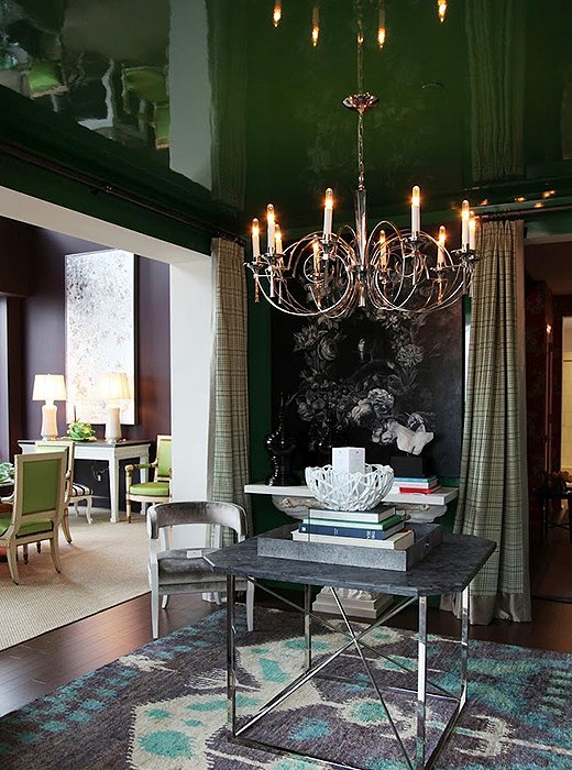
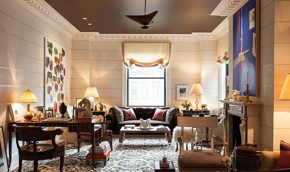
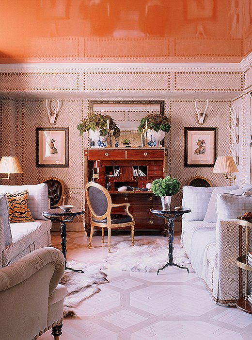
Inspired by: Painted Ceilings.


I love the look of a painted ceiling.

Such drama!


Such impact!

I was reminded of them recently when I went through some old notes I found while clearing out the basement files. I'd written:

  • Ceiling Height: perception of height can be manipulated with colour. "Paint the entryway ceiling a deep neutral and the white ceilings in nearby rooms automatically rise." from Small House, Big Style, BH&G, 2000

Bam.


Using colour to change one's perception of the volume of space. What's not to love?

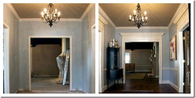
Ceilings seem to come in two versions.

Flat.


and liquid.

source

As much as I love a lacquered ceiling, the surface beneath the paint has to be perfectly perfect. And mine is most definitely not. In fact, I am kind of hoping a dark ceiling will help hide the gouges and cracks.


So guess what's my next project?


****************************************************
Want to know how it all turns out? Have these posts delivered right to your inbox!


**************************************************

Monday, March 7, 2016

Love Your Home Challenge: Day 9. The Home Binder.


I don't have any problem loving my home. I used to. There were parts of it I absolutely hated. I don't hate them anymore--but without renovations, they have remained awkward and difficult to deal with.

But, the best way to grow to love something is to take care of it: to invest time and energy. And yes, in the case of a room in a house, to make it pretty and functional.

To do that, you need a tool like the Home Binder. Accordingly, Melissa Micheals, who created the Love your Home Challenge, encourages people to create one:

Day 9 – A Home Notebook: Today let’s create a simple home notebook (or if you already have one, update it!). Set up a three ring notebook with dividers and plastic sleeves, or use a special bound notebook or an electronic note system on your phone or computer. Divide your notes by room so you can keep track of paint or fabric names, sketch floor plans or measurements of rooms and windows, lists of furniture or accessories you are looking for, keep garden notes, home maintenance/warranty information, and inspiration photos.


It's probably comes as no surprise to you, but I have had a "home binder" forever--and not just for this home. In fact, one of the first things I ever did whenever I moved into a new place was take its measurements and draw a floor plan. How else would you know where to put the furniture?

My home binder now contains floor plans and paint information, a wiring diagram and a cheat sheet for my light bulbs and fixtures as well as other things. But inspiration photos live on Pinterest, and garden notes as well as my warranties and manuals also have their own individual binders. My point is--what you keep in it reflects your needs at the moment.

I used to have a home binder almost exclusively devoted to the issues of organization and function(s) of each room. That's long gone, but I did discover some other versions of my home binder while I was clearing out the basement files last week. I found many old pages torn from House and Home magazine, articles on how to read decorating magazines, notes --handwritten-- on how to mix styles--how to visually raise or lower ceilings--make a room look larger--Jeffrey Bilhuber's favourite whites--all sorts of things. I may or may not do something on the blog with these.

But now--I most definitely want to paint my front hallway ceiling a darker hue!


****************************************************
Want to see that ceiling when it happens? Don't miss out. Have these posts delivered right to your inbox!


**************************************************

Thursday, December 3, 2015

The Case for Bigger Mouldings

My Mom has asked me to figure out the trim work for her house--you know, the baseboards, casings, the headers over doorways and windows, and, maybe, crown.

First, there's no doubt that trimwork increases the value of the house, is there?

Look at this:


Isn't that amazing?

And this:


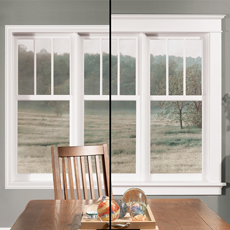
But, it has to be the right size. Most of the mouldings in our houses (unless you are lucky to live in a house built before WW1) are downright dinky.


Look at the difference here:


I have been researching what size they ought to be and while there's really nothing that says exactly, there is agreement that each of the components should relate to the other--and the height of the ceiling (not the size of the room).

It all starts with the baseboards.

These are 9 foot ceiling with 7 1/4 inch baseboards and 6 5/16" crown.


The same in an 8 foot hallway:


These photos come from a thread in Houzz where someone asked if her 5 1/4" baseboards were too wide. Someone answered, "Asking if your baseboards are too wide is like asking if your diamond is too big."

But tall baseboards can get expensive.

There are three ways I've found which might work. (But I have yet to figure out which will work for us).

1. Fool the Eye 


Imply a taller baseboard by installing a narrow piece of trim some distance above (no more than half the width of the original) --and paint it all the same glossy paint. This is an excellent solution if you already have baseboards and do not want to rip them out. It works well for adding heft to crown moulding, too. I'm not so sure it is a good solution for door and window casings, though, as the difference between the texture of the wall and the mouldings would be too apparent. Backband moulding is excellent for that.

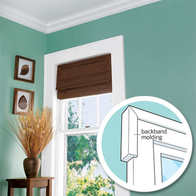
2. Add backband moulding

Again, this is an excellent solution if you already have casings or baseboards and don't want to rip them out.


This example shows how you it works. (Worth clicking through if you've no idea. It is a great little gif.)


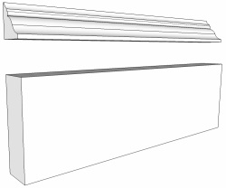
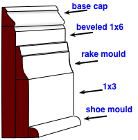
3. Stack the mouldings.

Apparently, this is the traditional way to install baseboard. It helps the trim move with the house--and so minimizes shifting and cracking. You could do this over existing baseboard, I think, if it is plain and wide.  The top piece is called the cap and the bottom is called the fascia.


In classical moulding, the height of the cap is equal to the total depth of the baseboard from the wall. (It's profile.)

Of course,no one says you have to adhere to classical proportions. Here, this enterprising gal just used a casing and flipped it so the narrow edges met together in the middle.


Or, of course, you can do this before you install anything to build up a profile you like.


As I mentioned, though, proportion is important.

From what I've read, the consensus seems to be that the baseboards and crown moulding should be about the same size, headers a bit smaller and the casings about half the size of the baseboards.

So, for example,

base: 5 1/4 to 6"
casing: 3 1/2"
crown: 4 1/4"
headers: 4 1/2"

or

base: 4 1/4"
casing: 2 1/2"
crown: 4 1/2"
headers: 4"

Another guideline seems to be that once baseboards reach 5 inches, casings should not be smaller that 3 1/2". I also read that the profile, or thickness of the boards should not be less than 3/4". That makes stock moulding from big box stores pretty much out of the question (unless it's stacked, of course). The thickest I've found is 5/8ths

This is what it looks like when your casings are roughly the same size as (or larger than?) your crown and baseboards:


The baseboards and casings are the same width here, too.


So, as soon as you think there's a rule--somebody breaks it--and breaks it well. It's all interconnected--and it all has to do with your own eye.

I'm off to the Big Box store to see what I can come up with!

Related Posts Plugin for WordPress, Blogger...