Design is all about solving problems. It makes sense that before you can even think about developing a design plan, you have to figure out what problems you want to solve--and just what the heck you want to accomplish with a decorating project, anyway.
yes, here I am in the bath tub backed up all the way against the wall to get this shot.
So, that's what I'm doing here.....backing all the way up and addressing the issues with this bathroom.
The room has some serious problems--what the Nester would call "lovely limitations."
Most of our lovely limitations concern this wall right here.
Only One.
It's our one and only bathroom with a tub and shower. Shocking, I know. In this world where everyone has their own television, almost everyone in the house has their own bathroom, too. Or so it seems. And it's not a big deal--except we need room for towels and storage and stuff.
Mold and moisture.
I blame the kids and their long showers. (Ok, to be fair, one kid in particular and her long, hot, steamy showers) but I am beginning to think it is more than that. I think the exterior wall is not properly insulated. We are reluctant to do any major repairs on this house as we're likely only here another ten years. (And the way things go in this neighbourhood, it will be torn down). The fan we have is inadequate. But even after we spend big bucks for a fan, I'm afraid we may still have problems.
I managed to get this mold remediated and this part of the ceiling primed and painted before deciding the bathroom would be my One Room Challenge project.
Low Ceilings.
This definitely adds to our moisture problems. It is low over the tub and shower because the turn in the stairs is right there at the back of the tub area. And the ceiling has been lowered over the sink and toilet area to allow for the installation of a fan. Someone used pine wood planks for the dropped portion of the ceiling. They worked well until I painted them. They are now yellowing. So I need to strip them and go back to wood: or repaint. But, because they are low, I feel I should keep things light and bright in here.
Teeny Tiny.
There is barely room to get out of the tub and towel off. That presents certain constraints with buying a new toilet, for example. Most are too long. (Our rough-in is also fourteen inches away from the back wall. Fourteen bloody inches. Who did that? WHY?)
Oh, what's a rough-in? The distance from the center of the bolts (i.e., the drainage hole) to the finished wall.
For us, that means a toilet with a rough-in of 12" (which is fairly standard) will stick out from the wall 2". What a waste of space! Meanwhile, my knees will hit the tub when I sit down. Ugh.
It's Vintage-ness.
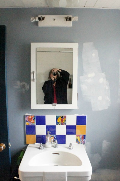
The sink is amazing. I believe it is a half-moon Crane. I want to keep it. The room would feel too closed in with a vanity, anyway, but it does mean we don't have drawers or storage of any kind.
The light fixture is undoubtedly original. It is lovely, but it has absolutely no wow factor. I am kind of scared to replace it though. And I'm not entirely sure I want to replace one builder fixture with another, albeit from a different era.
This is 24" long
detail of the lovely u shaped vintage glass shade.
Bossy tile.
We could remove this tile over the sink. I am afraid of damaging the walls beyond my ability to repair them. (We have plaster board, not drywall. It's practically an inch and a half thick.) My daughter has already threatened mutiny if I take them down. They were one of the very first decisions I ever made for the house--and I was so proud of myself for going bold!
The budget.
sigh. We've already agreed on a toilet less expensive than the one I really want. (The Champion Pro, by American Standard: right height round front toilet with lined tank). I don't think we want to pay for a new floor. I've already bought paint for the walls, so I feel committed there, even though I can feel my mind beginning to change.....
The je ne sais quoi.
The bathroom is choppy. Nothing unifies it. It has different materials on the ceiling--and the walls in the two separate areas. I feel I need to unify this teeny tiny room. It is also kind of uncomfortable. Nothing about it makes me smile. And more than anything, I want my home to make me happy.
Option 1:
- new fan
- new toilet
- new paint job
- new window treatment
Option 2:
- all of the above, plus
- new light fixture
- frame mirror
Option 3:
- remove the tiles over the sink
- create some sort of wainscoting
Option 4:
- all of the above, plus
- new flooring
Notice something missing? I want to try an experiment. While Chris is in there doing all the patching and painting, I am going to see just how much we miss the shelves. It would be fantastic if we could live without them!
Next up: Using Inspiration to solve a design dilemma. (I will link once it is up).


1 comment :
Sometimes making the right decisions is the toughest part of the job.
Post a Comment