
Taking out the closet meant moving the junction boxes in the ceiling so that each one is the same distance from both the back and side walls. Mom did that. She also moved the wiring for the switches. My Mom and my husband cut and installed drywall pieces. Now, my Mom is in the middle of taping and mudding. The bones of the room are coming along.
But really? This week, week three, hump week, if you will, was all about shopping and making decisions based on our inspiration.
Inspiration:

What makes a room great?
For me, it is always the balance struck between harmony--and difference. A perfectly harmonious room can be bland, boring. A room with too much difference however can be too chaotic, an utter mish mash of line and colour. It's an art, not a science--and we all like different degrees of harmony and difference.
Doing a room for someone else--no, with someone else, means knowing where they are on this scale of harmony and contrast. My Mom picked the above interior because, in her words, it is "clean, neutral (versatile), fresh and serene."
I have a high tolerance for contrast--and it's all the textures which appeal to me. As with any good neutral room, (and this is an extraordinarily beautiful room) the range of textures is wide, from soft fur and shag to gentle shell and all the way to shiny glass. There's pattern everywhere, from the tone on tone drapes, to the woven shades and bench seat and the line of nailheads on the headboard. Even the nightstands have inlay. I hardly know what to say about that statement piece at the foot of the bed. It captures every single element of the room. This bedroom is breathtaking. It is magnificent. I am in awe of this room.

It is also highly harmonious. There's not a lot of colour. Everything is white (off white, or cream) gold, silver, with the merest touch of black. There's not a lot of tonal contrast. Other than the curtain rods, the darkest element here is the headboard--a taupe, maybe, which seems to be the same tone as the darker one in the drapes. Mom and I spent a lot of time discussing this room in comparison to others and realised that it was this feature, this tight control of the tones in the room which contributed to the feeling of serenity and calm. Every time we considered buying something I asked her: will this make it look busy--or calm?
We have a small problem in her room in that we don't have those windows: they do a lot of heavy lifting adding visual interest to this wall. To take their place we thought we might use these pendant lights from Home Depot. (Our budget, by the by, is teeny tiny.)

I am worried they won't have the heft we need to carry the wall and balance the headboard. Following Pam's lead from a previous ORC, Mom wants to add mirrors behind the nightstands. We'll have to see.
Speaking of nightstands, I'll be joining that revered sorority of Ikea Rast hackers. Needless to say, ours won't have mother-of-pearl inlay. They won't even have Ostrich look-a-like vinyl. (Best Rast hack, ever. We did try to find a vinyl that might work.) No, instead, I think I may have to do something more pedestrian like this:

Mom has a beautiful antique walnut stained dresser that I don't want orphaned--and I think we can add the contrast without making things too busy. (Fingers crossed.)
As for the headboard, another DIY. There are so many on-line tutorials! We got the fabric for it, finally.
In fact we got all the fabric we're going to need for the room. It took us two days (and two fabric stores and one wasted purchase) to find it. And we had to change our colour scheme from silver and golds, cream and taupe to pinks, cream and soft brown. We just could not find anything we really liked for the drapes. (I ordered some lovely samples from fabric.com a couple of weeks ago but they haven't arrived yet and we are running out of time.)
Here are the fabrics we've chosen:

Every single one was at least 50% off. Mom was absolutely thrilled. She loves a bargain.
We're still looking for a rug.
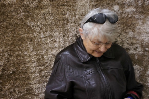
That's Mom.
and baseboard. I have yet to source nailhead trim for the head board. (I am scared to death that if I have to order it on-line it will never arrive in time. I am in Canada. Things can get hung up at the border for ages.)
So, the punch list is long: but we know where we are headed. And Mom's excited. She loves pink waaay more than silver and gold.

To check on the other crazy participants and their amazing projects, click here for the links to the invited designers and bloggers and here for the linking participants, like me.
See you next week, hopefully with a few things accomplished!

12 comments :
I really like the colors you've chosen--they are both calm and warm. So often "calm" seems to mean cool. Looking forward to seeing what you do with all that fabric. (Always admire someone who actually makes things with fabric, instead of just dreaming with it as I so often do!)
Love the feel of the room you are creating. So neutral, yet warm, and dimensional.
Love the inspiration for your room and the fabrics you've chosen!
Thanks everyone. Calm and warm--I'll take it. I am so nervous about this.
Love your fabric choices Alana! So pretty :) So fun following along on your progress!
Kendra @ www.joyinourhome.com
love it Alana! and your mama is adorable!!
Gorgeous colors and fabrics! Good for you tackling this project. You're at such a fun stage right now.
you may need some green or blue to get some balance! it's to warm... you will only notice after yo take some photos and make a comparison.
love you for loving your mother
:)
You choice of fabrics go so well together. I'm really fond of that fabric you chose for drapes.
And I learned a new word "sham" Thanks :)
Hi,
your list of things looks really interesting and I hope you pull it off. If you do want the look of inlaid drawers, you can do it with a stencil. I just did one for my room it was black and I used a pearl paint for the inlay. I love looking at it and it cost a fraction of what the real deal would have cost. I bought the stencil online at cutting edge stencils - you can get a discount - just look online for a code if you are interested
Good luck with it all
Kind Regards
Cathy
Thank you Cathy! I was about to purchase a stencil to do the drapes when I found out an order less than $50.00 would cost me $27.00 to ship to Canada. Couldn't do it, unfortunately.
A color that symbolizes calmness! Everyone said it and I like the fabrics you have chosen. I hope I can see the whole result! Gorgeous!
Sebastian Chuter
Post a Comment