Showing posts with label colour. Show all posts

Thursday, September 3, 2015

Design Dilemma: Colourful vs. Neutral

As you know, I stalled out during the makeover of my dining room/study during the One Room Challenge last spring. One of the (many) reasons was this perpetual dilemma I have with colour.

Chiefly, I am not sure how much I can live with.

I love colour.


I crave the sophistication (and calm) of neutrals.


For some reason, I had planned to make over my dining room/study all in neutrals.

But, I have my bookcase, I thought.


And its contents are anything but neutral!

There are a few neutralized Expedits and bookcases out there.


I thought long and hard about how I might neutralize my own Expedit.  I even went to IKEA to look for those square woven baskets. (My local IKEA does not have them.) But of course, there are all those colourful scrapbook spines to deal with.


So how about those bookcases which are colourful and allowed to sing, as it were?


source

Did you notice something?

In almost all the examples where the bookcase is colourful--the rest of the room is neutral. (The patterned footstool and pillow in the image above are still neutral.)

But what about using colour with abandon? Colour everywhere?


Gah--navy blue and pink. Traditional + modern. Gorgeous.

source

Ok, so, this isn't exactly using "colour with abandon," but it really isn't using any less colour than the example above: it's just softer.)

source (original seems unavailable)

This is a lot of strong colour!

And, of course, there's Edie's riotous workroom:


So, OK, Edie's workroom may have ust defined what's "too much" for me: but a million possible variations lie before me, still.

Where do you fall on the colour spectrum?

a) Oh, my eyes! Neutrals only, please.
b) Lovely bits of colour, just here and there.
c) Served strong just like my coffee: straight up, and lot of it!


Saturday, February 7, 2015

Colour Palette, Part 3: The Colours!

In Part 1, I talked about how  had essentially stumbled upon my colour palette by accident when I was putting the finishing touches on my living room.

In Part 2, I talked about how my hard finishes dictate whether the paeltte I choose for the house is based upon cream or white.

Now, finally, we're at the point where I can talk about the colours.

Lately, I've come across an interesting decorating blog called Teal & Lime. She has one post on choosing a whole house colour scheme which was completely fascinating and eye opening to me.

The first decision to be made is whether or not you want your neutrals to complement or contrast with your fixed elements. Your colours are a separate thing.

That was so freeing to me. My house has a lot of wood: wood with red and orange undertones. The wood is definitely a fixed element! My countertop (since I have no plans to change it) is another--as are my black and off-white tiled floors in the kitchen. The wood --all of it-- has warm undertones.

Although I like contrast, painting the walls to contrast these warm tones has never felt completely right. It felt too much like I was ignoring the house. So, for years, I've felt stuck into creating a warm colour scheme.

Living room, painted with MSL029 Glass of Milk on the walls and HC -143 Wythe Blue in the coving.


Obviously, I got over that in my living room this fall. But, as I explained in Part 1, I kind of stumbled into my palette.

To recap:

neutrals: black, white, cream, grey, navy, cognac
colours: deep blue-blue-green, turquoise.

(The rug looks like a dark blue and it is, but it is not just blue--there seems to be a hint of green in it.)

When it came time to do the kitchen, I had already decided on the deep jade for the cabinets. The colours in my shade fabric were the next to be introduced.

Kitchen walls painted RL4343, Elgin Gray


The colours in the fabric are essentially deep jade, navy and a periwinkle blue. I'm not really a fan of that periwinkle, so I am going to ignore it for now.


But, do you see a pattern?

Neutrals: black, white, grey (silver), navy, cream
Colours: deep jade (deep blue-green-green)

We've seen those neutrals before!

Moreover, that creamy white and that grey are warm. Both have healthy doses of yellow in their formulas. Both are gentle with the house.

But my colours, they are all cool. They contrast. Given I'm a fan of contrast, that just seems right to me.

So, that jade colour, though new, is connected to the colours in the living room: all my colours are on the cool side of the colour wheel.


(This is not your typical colour wheel, but I love how the creator of this one was sensitive to all the nuances of blue-green.)

As you can see, blue, blue-green (in all its various manifestations) and green are next to each other on the colour wheel. They're analogous. It is a highly harmonious colour palette. If they are next to each other throughout my house, the house should be harmonious, too.

This gives me direction for the rest of the house, too, which is excellent news.

Moving forward, my walls will be either grey (Elgin Grey by Ralph Lauren) or that creamy white (Glass of Milk by Martha Stewart).

I may introduce a feature or accent wall in shades (darker) or tints (lighter) of all my blue-greens. In other words, all the colours in the colour wheel above between green and blue..

From the top of the colour wheel, moving counter-clockwise:

dark bluish green (AF-510, Dragonfly by Benjamin Moore, kitchen cabinets)


bluish green (MSL 131, Feldspar by Martha Stewart, the accent wall in my bedroom). The bedding is a continuous happy work in progress....(in this shot the bed is all decked out in my neutrals; navy, grey, cream/white.)


turquoise (HC-143, Wythe Blue, by Benjamin Moore, the coving in the living room.


dark bluish-cyan, (MQ 5-25, Rush Hour, by Behr Marquee, on the backs of the living room bookcases)


or dark dark blue (2063-10, Old Navy, Benjamin Moore, kitchen chairs)


I am very anxious to paint my front hall way, my back hallway and the stairwell. I should also paint the dining room. (Not looking forward to that at all.)

I am pretty sure the stairwell will be Glass of Milk. But that doesn't mean I can't paint the bookcase wall (and the bookcases) something like Marquee's Rush Hour (the geek in me loves the idea of painting two bookcases in two different areas the same colour).

You know, this area here:


We shall see if I really want to go that dark.

(And I cannot tell you how much I want that yellow-green out of my life.)

It's exciting to have a plan. But it doesn't answer this pressing question: should I paint the dining room off-white to relate to the living room--or grey, to go with the kitchen?

And, I am curious: do you think a tight colour scheme like this might be a bit boring?

Thursday, December 11, 2014

Colour Palette, Part 2: White vs. Cream

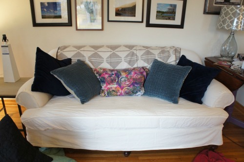
The couch photographed on reveal day. The walls are clearly a creamy white while the couch cover and lamp base look solidly white. 

oops.

I may have goofed.

This week I purchased Maria Killam's brand new e-book, White is Complicated.

In it, Maria distinguishes between two trends or "families" of colours: the Tuscan Browns; browns/beiges/golds/creams/earthy muted colours (on their way out) and the Parisian Greys: blacks/whites/greys/fresh, clear colours, which is all around us. There is also a third category which she doesn't discuss in the book but does on her blog. It has to do more with colour (and not white per se) and that is Fresh (off-white, cream, and clean, pale colours.)

For the Tuscan palette, creamy whites are best. For the Parisian Grey palette,  any white from blue-white to true white to an off-white will go well with the other colours.

Unfortunately, whether you can go with colours from the Tuscan Brown trend or the Parisian Grey trend isn't just a matter of preference: not if you want your home to be harmonious. In order to obtain harmony, whites, like the complex neutrals you will pick to cover your walls must go with the undertones of the hard finishes in your home.

I'm lucky. My home does not have a lot of "hard" finishes. I have wood floors, upstairs and down.  Downstairs, the oak floors have an orange cast. Upstairs, the wood has a reddish cast. The small amount of wood trim we have is also orange, though I call it cognac, since that makes it sound more current! This puts my house closer to the Tuscan brown family than the Parisian Grey.

My kitchen floor, on the other hand, with its black and white tile (and which I love) is firmly in the Parisian grey family of colour. The counter-top (with built-in backsplash), an ancient gold-flecked laminate, can go either way. But really, truly? The best white for my kitchen has always been BM Cloud White which is at the creamy end of off-white.

But wait. Black and white floors? Genuine oak floors and trim? Douglas Fir woodwork? Isn't that closer to classic than Tuscan brown? After all, these finishes actually pre-date the Tuscan brown trend by a few decades.

Wood floors are like Blue Jeans. They go with everything. Black and white floors certainly do, too. So, really, this house can go any which way I want. And I want Parisian Gray. Or, at least, I thought I did.

Even if my house's finishes did nudge me towards the Tuscan brown family, Maria allows for an exception. If my hard finishes (in the earthy and warm palette) can be described as light to medium toned rather than dark, then I can move towards the creamy off-whites (like Cloud White). Off whites belong in the Parisian Grey family of colour.

That sounds right to me. I will never have true white or blue-white in this home. (Well, OK, never say never) but when it is all said and done, true white and blue-white feel cold and harsh to me. So, I am happy with a colour scheme based upon off-white and creams. (But I don't have to go the earthy, muted colour scheme of Tuscan brown (thank goodness). I can go Fresh. (More on that later.))

But.

Here is where I may have goofed.

1) My north facing living room may not have enough light to maintain the ethereal quality of white. More importantly--and alarmingly-- the shadows of a darkish room may make the white look dingy and dirty: not clean and fresh. In these rooms, a pale neutral, or a little colour, or even greige would be better than a white.

Please forgive the mess that passes for Christmas decorations. It's a process.

I don't know. I think the shadows look fine. Of course, it is winter and the room is always brightest in winter from the reflection of the light off of the snow outside. (I know it looks awful. We're in the process of hauling out the Christmas decor and none of it looks right anymore.)

But, I think this same white might be the wrong choice for the adjacent dining room. Any white would likely be the wrong choice for the dining room. There's already an awful lot of white in it. Any more and the place will be washed out and drab. One window makes a cave: not a place where whites can come alive.

why, yes, those are new curtains. The room is currently painted French Vanilla CC 248 (or Papaya to all you Americans) by Benjamin Moore

see? Lots of white already.

2) Let's say white is the right choice for the living room: should it have been a white as creamy as Glass of Milk? Yes, I think so. Anything less yellow would have been too stark, I think. Is this the absolute best colour for this room? Who knows? I'm not painting the living room again for along time.

 It'll do.


Wednesday, December 3, 2014

Colour Palette, Part 1


Something happened to me when I bought all those accessories to play with in the living room last month.

Something good.

If you remember, I mentioned I bought a bunch of things to "try" to see what would work. I remember thinking: anything grey, anything teal, anything cognac (or gold), anything turquoise, black or white.

I went to a bunch of stores over a few days. I bought lampshades, pillows, throws and tchotkes. I bought all. the. things.

After my Mom had finished the slipcover, we put it on the couch and started "playing"

First, I decided between two lampshades: gold or grey? The gold didn't look substantial enough, so the grey was quickly decided.

The pillows, too, were pretty much a given. I'd had a heck of a time finding any that might work. So these: navy and dull turquoise made the cut. (I had a brighter, greener turquoise I considered but they lost their shape in less than a week, so they were not going to stay.

By the time I thought to take pictures, we basically just had the blankets to play with.

First, we tried the cream coloured cable knit blanket.


Not enough oomph. I like oomph.

Next up, a soft grey and cream with a cool pattern.

No.

Absolutely no. Though this could work with different pillows if one wanted a lower contrast look. I like high contrast.

Next, the blue blanket. (That's the old lampshade obstructing the navy pillow.)


I loved this. I thought that crazy pillow in the middle would be a wonderful dash of the unexpected and "bohemian."

Next, with the zebra pillow:


I really could not decide which one I liked more--so I sent Mom home to sew up both the day before taking the photos for the reveal. That night, reviewing the photos, I realised the black and white was best--not only did it repeat the high contrast thing going on, but my other two chairs had black and white upholstery. It was meant to be. Whereas, other than my pink flower topped cactus, I had no other pink in the room. (A colour should be repeated at least three times in order for it to look intentional and balanced.)

So, the living room has a colour palette:

neutrals: black, white, cream, grey, navy, cognac
colours: deep blue-blue-green, turquoise.

(photo from the reveal)

That turned out to be valuable information when it came time to re-do my kitchen for the style cure.

Wednesday, October 3, 2007

Day 4.3(d) Making Decisions


from House Beautiful, October 2007

#1. Forget the blue "accent" wall and paint the entire room one colour. This, for me, is huge. It saves not only the cost of a can of paint ($50) but also two days painting time.

Psychologically, though, it's freeing. In the back of my mind has been a plan to revert my rooms to "neutrals" so that I can spend a bit of money a couple of times a year and totally change "the look" of my room. A couple of comments in the article on "Blues" from the latest issue of House Beautiful actually convinced me.

Be careful about blue in a north-facing room--it can get chilly. And it's hard to mix more than two blues together. They start to fight.--Thomas Jayne

and

"Blue is tricky, it can go gray and sad." Elissa Cullman. pp. 28, 30.
(ahem, did I mention I fell in love with the "Belgium" look? Did you notice all the wood is unfinished? I can't help but wonder if I'll be sanding off all this work in the Cure Fall 08! We'll see if it grows on me.)

#2. I'm going to stain the drawer support units to match the desk. It can't match exactly: I'm working with different woods (plywood for the drawers and oak for the computer desk) so both the colour and the grain will be different. But I'm hoping that by mixing different coloured water based stains I can get close. And, I'll throw in the pine shelving too. Why not? Then the wall, as a whole, will look like one unit. That's got to be a good thing.

I was spinning my wheels a bit yesterday and today, not sure what to do. But now I can proceed.

--apply second coat of melamine to back of bookcase. This will free up the dining room table so we can move it into the kitchen, so we can move the kitchen table, so we can move the computer down to the basement (the next nearest phone hook-up location). That should all happen Friday.

--apply first coat of varnish to the little round table. (I'll be so HAPPY when I can get this dang thing done and gone. Now, I just have to find the assembly instructions!) Hopefully, that will be done by Friday or Saturday morning at the latest.

--sand drawer supports. (This is a LOT of sanding. Probably take a couple of days. I hope the weather holds!)

--so, Saturday, I should be ready to wash and spackle and sand the walls.
The husband has his days off on Sunday and Monday--so guess what he'll be doing! Yes, applying primer! and paint! (The handy husband has Tuesday off too, for Thanksgiving.) Dare I hope? One coat in the morning and one in the evening.

--pick up professionally framed needlepoint and deliver to Mom. She'll be so thrilled. I don't think either of us has ever had anything "professionally framed" before--and I went for the non-glare archival glass, double matting and everything!

--get "orangy" stain and more "chocolate" to stain the drawer units and pine shelving. I can work on this while the primer/paint dries.

So, that's that. I was even looking at new curtains while I was out running errands this afternoon. I can do orange! I can do green! I can do blue! I can do anything I want too!
Related Posts Plugin for WordPress, Blogger...