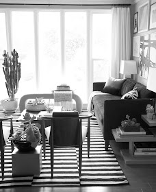
I have been wanting to slipcover my couch since the very expensive upholstery job we had done about ten years ago started failing--about eight years ago.
Until recently, I'd always thought I'd just do white cotton. Tough to live with, perhaps, but easy enough to throw in the washing machine to clean. Or so I was told.
But I never quite believed it. If I had, I would not have procrastinated this project for years. First, by inclination, and now by necessity, I need a slipcover that can co-exist with convenience --and the dog.
Enter the navy sofa.
There is no doubt that velvet is da bomb. But it is hardly dog friendly. When I saw this room by Ralph Lauren in House Beautiful (Sept. 2014) with the sofa covered in indigo denim, I was sold.
design by Ralph Lauren in House Beautiful, September 2014, photography by William Abranowicz
of note: chiefly monochromatic with warm touches of cognac and pops of red
ratio of dark to light: 4::5. Medium to low contrast room.
I've been collecting images of rooms with lots of navy and dark blue. I want to see if I can figure out how light rooms and a dark sofa can happily co-exist.
design by Lee Ann Thornton source
of note: lots and lots of cognac, in the wood and the leather. Lots of pattern.
ratio of dark to light: 2::5 Mostly medium tones. The navy acts like punctuation. It is not the main event. Bold contrasting pattern livens up a fairly low contrast room.
design by Victoria Hagan source
of note: if not cognac, then a paler cousin, seagrass and other natural fibres are making an appearance.
ratio of dark to light: 1::5. Again, the dark is not the main event, though the coffee table is the darkest thing here. Light floor balances light walls. Medium toned sofas tip this into a low contrast room.
 |
| design by Orlando Soria and Emily Henderson source |
of note: cognac and natural fibres. Sofa is the focal point.
ratio of drk to light: 1::3. High contrast room.
design by Victoria Hagan source
of note: a monochromatic room with unobtrusive touches of pink.
Ratio of dark to light: 3::5. (Maybe 2::5? The floors, though covered by a rug, are dark.)
Very high contrast room. There is next to nothing in medium tones.
design by Nate Berkus. source
of note: colour scheme is navy, cream, grey and camel. (All the neutrals). Texture abounds.
ratio of dark to light: 1::5 Low contrast. (Lots of medium tones present.)
design by Klara Wesot(?) source
of note: the reds liven things up. Wall adds enviable texture.
ratio of dark to light: 2::5. High contrast.
design by Emily Henderson, source
of note: cognac! and red and white.
ratio of dark to light: 3::5? Lots of medium tones present.
And I could not resist:
Rothko source
Ratio of dark to light: 3::1
I think I prefer a high contrast room: though I do want to introduce some cognac in my upholstery--or in a natural fibre rug (though I'm not sure that's dog friendly?) I love the pops of red. My ottoman/coffee table is darker than I would want it to be with a indigo or navy sofa. The left end-table is also too dark.


No comments:
Post a Comment
Don't we all love comments? Thanks so much for taking the time to share your thoughts.