Day 3: Find 6-10 Inspirational Photos for your Home.
Yes, sir!
I love this part of the cure. Though, I must say it is a wee bit disappointing to have the "style tray" concept reduced to a mere collection of pictures. The style tray was intended to capture more than just stylized photos of interiors--but everything and anything inspiring for your home: things you could touch and stroke: stones, pieces of wood, luxurious fabrics, textures like cork, or glass and colour--from paint chips or fall leaves
That said, I've always used pictures. I have an enormous folder where I collect images whenever I'm browsing the web. Once again, if anyone can help me out with credit, I'd welcome it.
Here's what appeals to me today:

I love this: but I'm absolutely and completely intimidated by it.
This is Lynn Von Kersting. Cote de Texas (where I found this image) calls her the "Queen of Clutter"-- and yet this is incredibly sophisticated and balanced. It feels like if there was just one more thing--the room might explode. Check out the link above, if you're interested. She does amazing work and it isn't easy to find, apparently.
This image is somewhat similiar, really. I hadn't realised it until I saw them next to each other. This is a pared down version, obviously, but I love the mix of fabrics.

How do I go from the above to the below? I'm not sure, except I love the yellow and turquoise together. I used this as inspiration for my kitchen painting project which I realize I haven't revealed yet. The table runner I want to use for the photo is in the laundry.
 (image from the House of Turquoise)
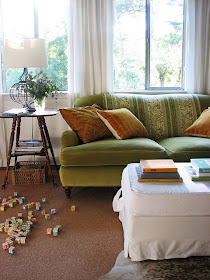
I'm not sure where I found the image below: but it contains my absolute favourite colour: orange. Mixed with green, the colour combination is one of my favourites. I fell in love with it a few years ago and only recently decided to embrace it.
I read once that one of the things which can unify a home is to repeat the same colour--one colour--but whatever shades and tints you like--in every room. Once upon a time that colour was green. I'm slowly turning over that colour role to orange.
 And this image is just pure romanticism.
PS: this collection acuurately captures my schizophrenia when it comes to interiors, I think. In truth, my style can be summed up thusly: Ikea meets Value village meets the second hand bookstore.
Day 4: Remove One Item and Set Up the Outbox.
My outbox is permanently set up: and I removed two, count 'em, two things from my home last week (not counting the clothing donation.) Still, my "outbox" --otherwise known as my "donation station"-- is falling over itself. So I can certainly gather a few things together for dropping off.

All cleared out: (well, mostly.)

I want to change this set up--as convenient as it is, I need a place for our clothing baskets (or, I think I do.) I like the way they're arranged here:
 (from BH&G)
I am flirting with the idea of setting up something similar where I currently have the donation station. It sure would be handy.

nice inspiration pics! I'm not sure how I'm liking this new cure... I'm doing it (when we have power that is...eek) but I'm not blogging about it....
ReplyDelete