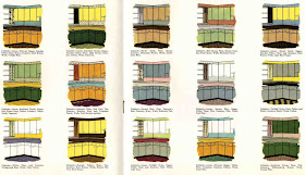
The second thing I learned was that toekicks were apparently painted black. Always. It helped the cabinets look as if they were floating.
I also discovered that two-tone kitchens were featured in magazines. I don't know how popular or "fashion forward" they were. This slide show of 1950s kitchens from the archives of House Beautiful doesn't feature any.
But here are a few I managed to find:
 The cheerfulness of the primary colours (plus white) is almost overwhelming to a curmudgeon like me. And yet, it appeals. Like a cartoon.
 The wall paper in this one reminds me of Curtis of old AT.
This illustration from Retro Renovation is fascinating to me. I could study it a long time.

And here is a current interpretation:

So, if I want that aqua--and a change--badly enough--there is precedent to painting just the bottom cabinets a lovely darkish aqua.
I'm still contemplating. I have no idea whether it would balance the ginormous top heavy cabinetry--or just look silly.

(Cleaning these inside--and out--is today's task.

What's gorgeous about the sample kitchens is that ALL the storage is closed in. I do like everything hidden!
ReplyDeleteBefore getting involved in painting cabinetry, I'd put some thought into cutting down the visual chaos of your stove wall by painting out or eliminating as much as possible. The sheer work involved in keeping that kind of area clean is demoralizing.
Hi Alana, glad you have found my site -- when you use photos from my site, can you be sure to credit back each one with a direct link? Many thanks, Pam
ReplyDeleteYour site is just amazing Pam, and I am sorry if I broke with proper etiquette. I've gone back and put in a link for the illustration of the Kitchen pallette--but I can't find the illustration of the Primary kitchen again. I believe the other two were from a different blog. I was travelling the web for several hours last might. In future I'll be sure to do what I can to save the page I took the illustration from as well.
ReplyDeleteWhen the MR. and I got married we rented an old farmhouse that had an aqua kitchen. Aqua metal cabinets and aqua and silver flecked formica countertops. turquoise wall stove, burners and a white fridge. I liked it for a while, then, not so much. It wasn't the cabinets that got me though , it was the countertop and the glittery-ness of it all...
ReplyDeleteThat DOES look like some of Curtis's "wallpaper!" :)
ReplyDeletefun kitchen pics!