Monday, August 31, 2015

From the Weekend: A Whole Lot of Plannin' Goin' On

This was supposed to have been a picture from my trip to Vancouver.
But it was cancelled.

A couple of days spent planning at my desk is more my speed right now, anyway.


And what I need.

Friday, August 28, 2015

How I Decluttered my Gall Bladder


1. Be diagnosed with gall stones and an inflamed gallbladder.
2. Ignore the good doctor's advice to have it removed--for two years.
3. Wake up one day, eat a piece of pie and feel nauseous.
4. Wake up for the next four or five days thinking you have a bad case of acid reflux.
5. Go to a medicentre on Friday where they diagnose the pain as definitely NOT acid reflux.
6. Go to the hospital where a test for my pancreatic enzymes is off the charts. My pancreas is essentially digesting itself because it is blocked. There are two main causes for this: alcohol and, you guessed it, gallstones.
7. Stay in the hospital for a week where they perform two procedures--one on Tuesday morning to take out two gallstones stuck in the duct the gall bladder and the pancreas share and, one Thursday evening to take out the pesky gall bladder. Learn patience, humility and how to sleep amid a million interruptions and sounds and people coming and going. (One nurse remarked, "a hospital really isn't a good place for sleep." There was even heavy construction!) Learn how to live without any wifi whatsoever.

I received excellent care and everyone was so helpful and kind. Amazing, really.
But I'm glad that's over.

Tuesday, August 18, 2015

Inspired by Dressers: All Dressed Up

I have been thinking about dressers--a lot.

This is why:

It's an IKEA MALM from a way way back.

Pretty drab.

I'm not sure what to do exactly--go all colourful and bright? Or should I make a quieter statement--so I don't upstage my gorgeous blue doors?

doors: Hague Blue (by Farrow and Ball) mixed in to a Sherwin Williams paint. 


I have been admiring colourful dressers for years.

Here's one in coral:

source: Coral Gables 2010-40 by Benjamin Moore

Jenny Komenda is such a master of colour.

source  Billiards Table by Behr

I love green, too. 

source Hunter Green oil based paint by Rustoleum.

Here's another beauty in green:

source: Precious Emerald by Behr


No doubt about it, a brightly painted piece can make a huge impact in a room. 

Lately, I've been more and more drawn to wood. Wood makes a statement too, albeit, a quieter one. Ahem, except for maybe this next piece.

Absolutely gorgeous. This also belonged to Jenny Komenda. I would put this into my hallway in a heartbeat. 


This next isn't quite the diva. I like its playfulness:


 And this two tone look.

I am absolutely bowled over by that lamp

The reverse effect is stunning, too:


Perhaps this is the humblest of the bunch. Still. Just lovely.


source. top, special walnut.

Do you have a preference? Diva-like or quiet? Painted or wood? How do you like your dressers? 

Thursday, August 13, 2015

Styling the Mantel


Justina would have me style a console--but I wanted to play with my mantel instead.

It has one function only--to be a dramatic focal point for the living room.


The painting is a thrift store score. I found it while shopping with my Mom--a rare thing. It fit this old frame I had perfectly.

It fills the space nicely.


Tall + dramatic draw the eye. These pussy willows have been on the mantle since the Spring--and though they really do say "Spring" more than summer, I love them. The books not only heighten the drama--they help balance the long horizontal space. They also bring the colour of the vase over to the other side of the mantel and add some lovely texture.


On the right side, I started with this bird I bought last fall at Target. (Dear departed Target. I'm still upset you left me.) The wood matches the buds exactly.

Then, for bling--and colour--I put this vase I bought just last night at Home Sense. You may remember my frustration trying to style the coffee table. I live a fairly accessory-free life and I just don't have that many options-- so off I went in hunt of pretty things. This is one of the things I found.

The rocks were just lying around, so I just piled them by the vase. There's one on the book on the opposite side, too


I love it. There are groupings. There's tons of texture. The colour palette is tight. (Repeating the colour scheme of the vase with the books--but in reverse kinds sorta thrills me to pieces.)

I give myself an A.


This post is part of a series based on a course I am taking at skillshare by Justina Blakeney called Style Your Space Like a Pro.

Assignment 1: (Identifying) The Styling Principles Of Justina Blakeney
Assignment 2: Styling the Coffee Table
Assignment 3: Styling the Sofa, sort of.

Tuesday, August 11, 2015

Styling the Sofa, Sort of.

I had plans to style the sofa--but it seems I need more pillows--and that involves shopping. Since my retail options are few and far between (and pricey!), I thought I'd cheat and use the internet.

Styling the sofa is really all about combining pillows and throws--putting patterns, colours, and textures together. One of my favourite things to do! I was up until the wee hours last night looking at fabric and pillows and throws--and was right back at it first thing this morning--before my coffee, even!

I've learned a lot about mixing patterns over the years. Here's a great how-to article.

1. First, patterns are loosely categorized like so:

Geometric:

Organic:


Loose, or open:


Tight, or closed:


Light:


Dark:


Simple:

or complex.

I have to say this is probably one of the most complex patterns I've ever come across.


There's also all sorts of textures to consider, too, from smooth indoor/outdoor canvas to soft faux fur. (Ok, so I know there's a thing called sequins--and people put them on pillows. But the number one need for a pillow? Nap-time. So, no sequins for me on a couch pillow! Ever.)

Controlling contrast--letting some things be the same and others different often set the mood and style of the whole room. For example:


The strict black and white palette is high contrast--but the lack of colour keeps things clean and pure.


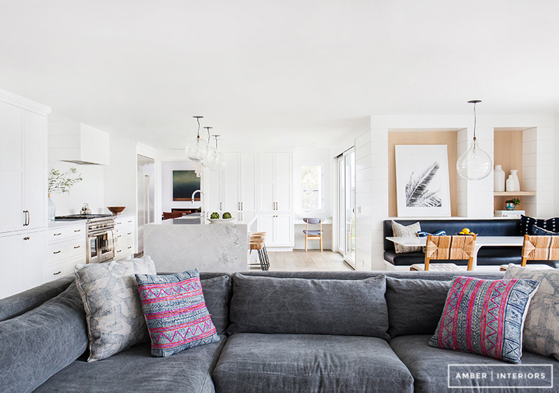
Amber keeps the contrast here remarkably low. The pink keeps things from fogging over. Textures take pride of place.


Emily Henderson mixes both contrast and colour--but controls the pattern closely. Everything is a variation of a geometric pattern. It's crisp and clean and somewhat masculine.


2. Colours don't need to match--they just need to go together.

Each one of the above pillows goes with the one below--even though the colours may not be a "dead match." (Computer monitors vary in how they represent colors. An orange on my screen may read as a red on yours.)

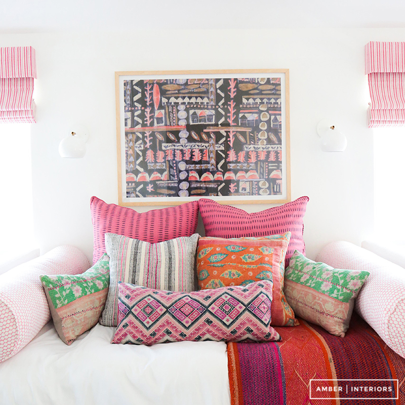
This is a wonderful example:

Makes me think of sherbet and summer time. Nothing matches--but it all goes.

I wouldn't have thought to add that blue and gold pillow--but it makes the vignette.


3. I love the concept of the linking piece (or in some advanced cases--pieces). These pillows from West Elm illustrate the idea perfectly.

sources: 1/2/3

Not only do the supporting pillows echo the colours in the sparrow--but the patterns on his body as well.


So, what combinations did I come up with?
These would be for my sofa, in my living room.

This is where we left off.

Given I put up a faux brick wall in my dining room, I am trying to introduce a bit of coral or rusty orange into my living room to help the two rooms relate to one another.


My selections are all variations of the same combination: organic plus geometric plus a solid. In each, the organic pattern provides the link.

I envision the first pillow as a lumbar (like the faux fur zebra above) with two in each corner of the sofa--one in each of the supporting players.

Combo 1: (Waverly Lotus)
sources: 1/2/3

Throw: black and white or light blue. This is a high contrast look. For the more colourfully inclined, there's a violet lurking in those lotus pads.


Combo 2: (Tucuman Multi)
sources: 1/2/3

Lower contrast--but still, opposites at play. Throw: deep blue--but really anything from the lead fabric would work, even a rusty red.


Combo 3: Zen Garden
sources: 1/2/3

throw: love to find an orangey rust one for this combo. A caramel faux fur would be gorgeous. A silver fox faux throw would keep the grouping tight.


When I tried to deviate from this arrangement, I wasn't as successful:

sources: 1/2/3

One of these just doesn't belong. That first pattern (Iman Gem Market Embroidery Henna Fabric - $55.00/yard)  may just be too dense for the others.

Assuming the reds/rusts can all get along, this may be a better combination.

sources: 1/2/3

throw: a nice darkish grey faux fur for winter or light grey cotton for summer. Or, throw caution to the wind and go for the greeny gold.


You may have noticed a lack of throws. I found the on-line pickings a bit slim. Besides, it's definitely something I'd have to touch and feel.

Here is a masterful example of how the throw can be that lead piece. The orange pillow looked out of place to me--until I saw the throw!


Looking closer, the throw and the front lumbar pillow just might be co-stars in this production.

My favourite is Combo #2, I think--especially as we approach fall. But I think I can make Combo #3 work with what I have--all I need is the floral and I can let my zebra sub in for the snow leopard, and my navy velvet for that stunning pleated diamond pillow cover from West Elm.

What do you think?
Do you have a favourite?
Is there a formula for mixing patterns you like to stick to?

If you'd like to follow my assignments for Justina Blakeney's skillshare course, Style Your Space Like a Pro, you can catch up, like so:

Assignment 1: (Identifying) The Styling Principles Of Justina Blakeney
Assignment 2: Styling the Coffee Table

Saturday, August 8, 2015

Styling the Coffee Table


I am taking a small course from Skillshare by Justina Blakeney, called Style Your Space like a Pro.

I've been wanting to learn how to style properly for a long time. Copying pictures from pinterest  just didn't work for me. Justina's approach is kind of perfect for an analytical mind like mine.

First up, a mini lesson on bouquets. These are my efforts. I forgot to buy some greenery.

The most adventurous I get with flowers is to buy two different kinds but in the same colour. This time I bought three!

The first lesson in Justina's course is all about the coffee table.

Here is my before shot:


Yeah. That's a sorry sight.

To get started, she suggests I get books (for guests to browse through) and trays to hold things.

Um, guys?

I don't have coffee table books to browse through. Well, Ok, I have a few beloved decor books from eons ago (like before I was married ago) and I am NOT putting those on a coffee table where my husband just might put his feet or I might just spill a drink.

Just no.

So, I had a heck of a time getting started until I just decided to put the flowers and candles down.

Justina also provides suggestions for photos. This is the "overhead" shot. Oh--and that orange? It's my "sign of life."

Needs? Honestly? I want to discourage my husband from putting his feet on it!*

Shape? Love all the round things. There's actually very few straight things. I could almost use more straight things in my life, couldn't I? There are flat things and tall things. I need more variety for tall things. All I really have for that is candles.

Colour palette: Well, there's a lot of colour happening--probably more than I'd like--and none of it is related to each other--or the sofa. Definitely room for improvement, here. (I am wishing for another vaguely orange or coral thing by the candlesticks.)

Pattern: Given the coffee table's proximity to the sofa and a rug, Justina asks, "Do you need pattern?" I decided not to worry about it. (Though, I do confess, I'm on the look out for a small wooden zebra.)

Texture: the flowers, and the fruit, naturally. Also: the dog. Love the dog.


Placement: Three things on the table. Three things on the stack of catalogues. Three kinds of flowers. Say hooray for three!

Bling: Yep. Got that. In fact, I have far too many bling-like things.

Botanicals:  Yep, absolutely! And not just the sorry succulents, either!

And finally, the mid-shot.


Now, that was useful. And fun! I want to do it again. This exercise helped me identify what sort of things I'd like to have. For example, I don't have any pillar candles--or votives, either! I need tall things that aren't candles.  I don't have many things with rough textures--everything is kind of shiny and smooth. I need trays. I've been wanting something to help me figure out what I need: this is it. The list is long. And growing. I want to buy all the things. The frugal minimalist inside me is having a heart attack.

Up next?

That dratted sofa.


Assignment 1: Identifying Justina's styling principles is here.

*As I was finishing up this post, I glanced into the living room, and there was hubs completely chilled out on the sofa--with his feet on the coffee table!

Thursday, August 6, 2015

The Styling Principles of Justina Blakeney

I am so thrilled I have found Justina Blakeney and her Skillshare class on stylingStyle Your Space Like a Pro.

My first assignment is to identify all eight of her principles for successful styling in an inspirational photo.

Here we go:


1. Needs: An attractive dresser top

2. Shape: I love the way the sails in the painting are echoed in the shape of the lamp shade. Also surprising to me is how it doesn't take very much--just the topiary and the knobs--to add some variation and contrast to all those rectangles.

3. Colour: This surprised me too. Just how many colours are happening here? Essentially, two. Brown and blue. Well, ok, three: white, too. OK, ok, I see it: Four, if you insist we have to include the yellow from the books and the frame!

4. Pattern: Again, minimal.

5. Texture: now, here, in this tiny vignette, we have quite a few. Rough: basket, books,  Soft: the lampshade, the plant. Smooth: the beautiful wood of the dresser, the china lamp base and plant pot, the dull gold of the frame.

6. Placement: Symmetrical "smile." Great balance of verticals and horizontals.

7. Bling: The gold frame.

8. Botanicals: The topiary.


That was fun: let's do another.


A minimal example: but it's all here!


I am just analysing the credenza and the wall behind it, not the room as a whole though this is a most excellent room.

1. Needs: an uncluttered surface, so you can lay out dinner in a jiffy.

2. Shape: The sconces, the plant pot and the big glass balloon thingy are a fabulouscontrast to the  rectangular lines of the photograph (painting?) and the buffet.

3. Colours: Pink and green. Opposites. Lots of energy.

4. Pattern: All in the artwork.

5. Texture: Rough? The plant pot looks vaguely cement-like, the plant is certainly rough around the edges. The books. Yes, the books. Soft? Can the plant be both rough and soft? Smooth: glass, the metal in the sconces, the polished wood of the credenza.

6. Placement: Again, symmetrical.

7. Bling: All the shiny things.

8. Botanicals: the plant, obviously.

Love how everything for a successfully styled vignette is there: and it's so minimal!


I can't wait to share the rest of the class and my assignments with you!

Tuesday, August 4, 2015

Inching Along


We had a great mini-vacation visiting family for a wedding. A day of driving, a day of family and festivities and a day of driving back. I love south-eastern Alberta. I regret I didn't make more of an effort to take some pictures. So. much. sky.

But here we are home and happy about it, too.

In fact, I felt good enough to tackle the table from h#ll.

I haven't blogged about it because I figured I'd do a "how to" after the big room reveal--but the room reveal is a ways off, yet, and the table turned into this vastly complicated undertaking. It involved buying special tools (orbital sander, anyone? A new router bit to make biscuit joints.). The stain didn't take evenly. Then the pipes rusted--and a few stuck together--forever. We even screwed up on the wood--not realising that The Big Box store doesn't differentiate between pine, spruce and fir. (It's all just soft wood.)

And I'm not in love with it.

#1. In spite of Chris's best efforts, the top is not straight. That makes it a bit of a challenge to put on a base made of pipes--which may or may not be the same height at each one of the four legs. (Pipes don't behave like other threaded things do.)

#2. I detest the shiny, plastic-ky finish. I knew I would. I used Varathane's Bar and Table Finish. It's an epoxy. I thought it would help fill in the cracks and even things out. It didn't. It also created a really hard edge that cuts into my arms.

#3. It is too long for the room.

It is together--but nothing is screwed down, yet. Sigh.

Yes, that green thing is tape. It needs to be sanded off.


Related Posts Plugin for WordPress, Blogger...