Monday, February 23, 2015

From the Weekend: Decluttering the Basement


The first time I approached this pile, I set my timer for 15 minutes and went in for the easy stuff.

Empty boxes? Break 'em down for recycling. Things that belong somewhere else? Take them there. That was the first fifteen minutes. It didn't look like I'd done a thing.

I waited a few more days--then, it was a day off: Saturday. Another 15 minutes.

I was immediately overwhelmed. I couldn't even reach the items I knew what to do with--so I went round the other side. Bam! I came across two beautiful pillows that used to be in my living room. I had no idea whether they were to stay or go. So, instead of hitting a roadblock right away, I put them aside "for later." Then, I was staring at a pile of fabrics--and, for me, that was easy.


I figured I was done for the day. But later, I had a few minutes before dinner, so I set the timer and headed back down. When the timer went off, I was beginning to see some progress, so I kept going. I continued working past the timer for about another 15 minutes.


There are so many decisions to be made when you're decluttering! It is not cheating to stick with the easy stuff--to ease into it, as it were. (Sorry about that.) It's weird. It's like dealing with a muscle. Once your decluttering brain gets warmed up, it gets easier and easier--even as you begin to wade into the more difficult stuff. I think that's why it's a good thing to do "declutering binges" --like doing  a bag a day for 40 days, or a certain number items per day for a month (The Mins game), or by going through the whole house, category by category, for about 6 months (the Kon-Mari method).

Guys, I don't know what I am going to do once I get to the bottom of this area. I was reading over this article today and realised I have nothing, really nothing I need to get rid of according to a list like this. 

Monday, February 16, 2015

From the Weekend: Last Weekend


This is actually a photo of my desk from last week.

Why am I showing you a picture from last week?

Because that's when I decided to prep like mad for this week. I did my menu plans for two weeks (last week and this), made two meals instead of one on more than one occasion, and I got all caught up on the laundry so that this week would be worry free.

Why all the prep? Well, finally, I am getting more hours at work--and I did not want things to fall apart at home.

We'll see how it goes. If it works, I may have a strategy for coping with work and home.
Wouldn't that be incredible?

Friday, February 13, 2015

So Good.

It wasn't supposed to happen.

I took all of these "before" pictures on January 29th.

At least not like this. Not today.


I'd vowed to get every single stitch of laundry done by bed-time tonight. (I won't have another day off until Tuesday so today was "prep for the long haul" day). I started up a recording of a webinar I'd missed for the Sea Change course I'm taking from Leo Babauta and away I went.


While my daughter was trying to get laundry done in this mess (and honestly, who can get laundry done in this mess?) the shelf came down and the box of washing soda spilled all over the top. So, it was relatively easy to wash this up once it was cleared off.

It had been one of my goals for February, but I had been working at a snail's pace--not even 15 minutes here and there, more like move one item from here to there, and oh! here look, maybe another.


Meh. I suppose I could put that shirt of my husband's away in his closet some day soon. Then again, he won't be needing it for another 2 1/2 months.

But, on a precious day off, I continued to declutter my laundry room until I found myself sweeping the floor and then clearing and cleaning the surfaces.


Unfortunately, the dryer was covered with spots and blobs of wood stain from projects I'd done last fall. I worked at them with paint thinner--while the dryer was working. Probably not the greatest idea. There was quite the smell.


I even cleared off the little project table!


Yes, I believe that's the same big black garbage bag as before. It could be a different one. Nonetheless, it comes in handy for old shoes and coats and things to worn out to donate and too big to fit in the kitchen garbage can.


Unfortunately, the combined smells of washing soda, bleach and paint thinner have left my stomach feeling a bit odd. And, other things I had planned to do didn't get done.

But the kids can vacuum the stairs and wash the kitchen floor, right? They have a three day weekend.

They'd better.

Saturday, February 7, 2015

Colour Palette, Part 3: The Colours!

In Part 1, I talked about how  had essentially stumbled upon my colour palette by accident when I was putting the finishing touches on my living room.

In Part 2, I talked about how my hard finishes dictate whether the paeltte I choose for the house is based upon cream or white.

Now, finally, we're at the point where I can talk about the colours.

Lately, I've come across an interesting decorating blog called Teal & Lime. She has one post on choosing a whole house colour scheme which was completely fascinating and eye opening to me.

The first decision to be made is whether or not you want your neutrals to complement or contrast with your fixed elements. Your colours are a separate thing.

That was so freeing to me. My house has a lot of wood: wood with red and orange undertones. The wood is definitely a fixed element! My countertop (since I have no plans to change it) is another--as are my black and off-white tiled floors in the kitchen. The wood --all of it-- has warm undertones.

Although I like contrast, painting the walls to contrast these warm tones has never felt completely right. It felt too much like I was ignoring the house. So, for years, I've felt stuck into creating a warm colour scheme.

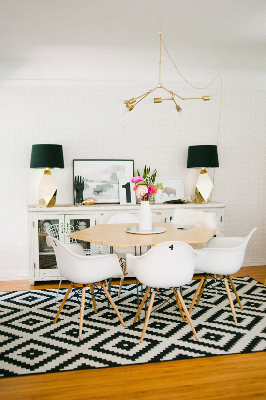
Living room, painted with MSL029 Glass of Milk on the walls and HC -143 Wythe Blue in the coving.


Obviously, I got over that in my living room this fall. But, as I explained in Part 1, I kind of stumbled into my palette.

To recap:

neutrals: black, white, cream, grey, navy, cognac
colours: deep blue-blue-green, turquoise.

(The rug looks like a dark blue and it is, but it is not just blue--there seems to be a hint of green in it.)

When it came time to do the kitchen, I had already decided on the deep jade for the cabinets. The colours in my shade fabric were the next to be introduced.

Kitchen walls painted RL4343, Elgin Gray


The colours in the fabric are essentially deep jade, navy and a periwinkle blue. I'm not really a fan of that periwinkle, so I am going to ignore it for now.


But, do you see a pattern?

Neutrals: black, white, grey (silver), navy, cream
Colours: deep jade (deep blue-green-green)

We've seen those neutrals before!

Moreover, that creamy white and that grey are warm. Both have healthy doses of yellow in their formulas. Both are gentle with the house.

But my colours, they are all cool. They contrast. Given I'm a fan of contrast, that just seems right to me.

So, that jade colour, though new, is connected to the colours in the living room: all my colours are on the cool side of the colour wheel.


(This is not your typical colour wheel, but I love how the creator of this one was sensitive to all the nuances of blue-green.)

As you can see, blue, blue-green (in all its various manifestations) and green are next to each other on the colour wheel. They're analogous. It is a highly harmonious colour palette. If they are next to each other throughout my house, the house should be harmonious, too.

This gives me direction for the rest of the house, too, which is excellent news.

Moving forward, my walls will be either grey (Elgin Grey by Ralph Lauren) or that creamy white (Glass of Milk by Martha Stewart).

I may introduce a feature or accent wall in shades (darker) or tints (lighter) of all my blue-greens. In other words, all the colours in the colour wheel above between green and blue..

From the top of the colour wheel, moving counter-clockwise:

dark bluish green (AF-510, Dragonfly by Benjamin Moore, kitchen cabinets)


bluish green (MSL 131, Feldspar by Martha Stewart, the accent wall in my bedroom). The bedding is a continuous happy work in progress....(in this shot the bed is all decked out in my neutrals; navy, grey, cream/white.)


turquoise (HC-143, Wythe Blue, by Benjamin Moore, the coving in the living room.


dark bluish-cyan, (MQ 5-25, Rush Hour, by Behr Marquee, on the backs of the living room bookcases)


or dark dark blue (2063-10, Old Navy, Benjamin Moore, kitchen chairs)


I am very anxious to paint my front hall way, my back hallway and the stairwell. I should also paint the dining room. (Not looking forward to that at all.)

I am pretty sure the stairwell will be Glass of Milk. But that doesn't mean I can't paint the bookcase wall (and the bookcases) something like Marquee's Rush Hour (the geek in me loves the idea of painting two bookcases in two different areas the same colour).

You know, this area here:


We shall see if I really want to go that dark.

(And I cannot tell you how much I want that yellow-green out of my life.)

It's exciting to have a plan. But it doesn't answer this pressing question: should I paint the dining room off-white to relate to the living room--or grey, to go with the kitchen?

And, I am curious: do you think a tight colour scheme like this might be a bit boring?

Thursday, February 5, 2015

Studies, Libraries and Dining Rooms

I am a wee bit stuck on how to progress with the dining room/home office (which I've decided to rename the dining room/study).

I have my own little Style Cure planned for it, loosely based on the Style Cure AT hosted last fall.

So, this is my style tray. If anything strikes you as a common theme in these images please let me know. Sometimes I can have quite the blind spot for the dead obvious.


I like this because it feels just like a library with the table (and what a beautiful table!) in the center of the room. The shelves and books feel like part of the walls--not intrusions into the room. It makes me wonder about the feasibility of doing away with my desk entirely and getting a beautiful table and using it--and only it--instead. I am not a fan or working at a round or oval table, though. I prefer an ell shape for a work surface. 


The red is a bit much! But I love the comfy chair by the window and the books on the shelves beside it. I don't have a reading chair in my dining room. I'd like one--but there's no room for it currently.


This is brilliant. The table is a dining table--isn't it? The white chair is a dining chair--but the yellow one is an overstuffed reading chair. I wonder if I could do this? Bring out the laptop and work in a chair like the white one and then switch to the gold one when it was time to read or get cozy.


This is one of my all time faves. Again, an inviting chair by the window. That table is really something else, though, isn't it? This has the right feel. Light and bright. I don't want the room to feel too heavy.

All of the above shots inspire ways of arranging the furniture. I'll do a post on floor plans, soon.

This next set of pictures capture something of the feel I'm after. I love the idea of dark and moody: I'm just not sure I could live with it, here, where I crave light six months of the year.

This one is colourful, but not terribly over the top. Maybe there's just one or two too many paintings hanging off the bookcase? Not really a fan.


Light and bright:

Of course, the scale here is ridiculous!


And look, closed storage!

Moving on.

One room, two ways:


Now, a dining room.


This is the perfect blend of modern and traditional. That chandelier creeps me out and intrigues me at the same time.


This next chandelier I could probably figure out how to make!
I look at those Nate Berkus lamps from Target and I mourn. Love the subtle wall paper here, too. Adds some interest to those bare walls.

source


I think it is all the contrast in texture which appeals to me here. The softness of the fabric on the Louis chair vs the hard metal of the lamps and table--their sleekness against the fluffiness of the rug; black vs white, modern vs antique, warm metal vs cold.

But, really, if we're going to be a minimalist about this?

I could do just what Jane Austen did:


It's worth clicking through.

Thanks for all your thoughts. They are helping me think this through. Any favourites, above? Any similarities you've noticed above? Any suggestions? 

Monday, February 2, 2015

From the Weekend: Scenes from Decluttering The Dining Room

Where we were Friday afternoon.


I wanted some room to breathe.

That's all.

Just a little space in this room where I hang out on the computer. Where I write. Plan menus. Plan my day. Pay bills. Keep the budget. Read. Sew. Work on my scrapbook projects (though they be few and far between).

I decluttered like a madwoman this weekend because I wanted this wall--without its shelves--to make sense.


Does that make sense?


This room is small. It is cramped. The furniture climbs every wall.

To the left of the desk:


To the right:


I secretly long for a real dining room. A dining room with a sideboard and flanking chairs. The top of the sideboard would be arranged in perfect symmetry with matching lamps at each end. A big painting in the middle. A table with flowers. A room only used three times a year--now that would be luxury!

But it is what it is.

And it had a whiff of "museum." You know what I mean? Way too many things that have nothing to do with my life right now. Too many homeschooling things left hanging about. A project I may or may not pursue. The scrapbook supplies. (I haven't scrapped since starting--and stopping Project life for the first 15 weeks of last year.)

Old planners, old notes and books and projects and classes I had clearly finished. The low hanging fruit. Paper. In binders.

Always start with the low hanging fruit.

Paper on the left is all that remained to keep from these binders. As soon as I'd checked I had some of these on the computer, I let them go, too.


The entire contents of the three inch binder were put into recycling. All of it--all of it had been homeschooling things. For one split second, I considered keeping the maps so I could fill them out--and then realised how crazy that was. I was able to empty the Simplify 101 class notes in the three binders on the left into it--and I was glad to. I refer to those notes--and I was always hunting the binders down.

I just kept finding more and more to let go of:


 I can't even remember what it all was!


An over full wastebasket. (This was all emptied into the recycling bag.)


Hooray for an empty shelf!

There was even more low hanging fruit on the Expedit. I washed out each cubby as I emptied it.


Here's the thing.

I left the tough stuff alone.

I thought about it.

I took some time and looked through some of my scrapbooks to ask myself whether I want to continue or not.

I thought about resuming my project.

I got advice.

And I kept asking: Do we have enough space yet?


This is 36" x 48" engineering print.

I love the drama. But, in the end, it demands a different room, I think.

And what we have is this room.


This one is 24 x 36. It is taped to an Ikea Ribba frame.


Some side by side before and afters--just 'cause they're fun.

This was a wonderful transformation.

 The change is a bit more subtle here:


Well, damn.

After all that.


Looking at this, now, side by side like that? I don't like it.

I can do better.

Related Posts Plugin for WordPress, Blogger...