
As far as I understand it, Chairish is a web storefront through which people like you and me can sell our furniture and home decor. Well, if we had beautiful and valuable pieces.
As you know, my dining room/study has been on my mind for a while now. I have longed for a dedicated dining room. One of the challenges of a dining room is that you can wind up with a lot of wood. Chairs, tables, a credenza or a buffet--there are many choices and in all kinds of woods. And that would certainly be one way to go.
I went a different route.
You know the seventies are back, right?
What better way to make a design statement than to embrace it full on.
Like so:

The write up identifies it as designed by Pierre Cardin, from 1976. I love it's chunky straight forwardness.
With a table like this, I could have gone in any direction for the chairs. I liked these delicate gold and white cane chairs. Contrast is my middle name.
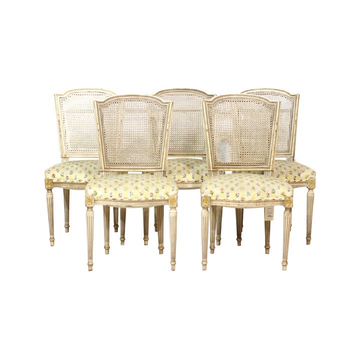
My fictional dining room is off to a great start. It now has a mix of metals (chrome on the table, gold on the chairs), of line (thick table legs, thin chair legs), of mass (closed chunky table, open, delicate chairs), and of colour.
I want to add in a couple of chairs for the end seats as there are only five chairs in the above listing. (I'd place four around the table and one somewhere else.)
These supporting players would work well:
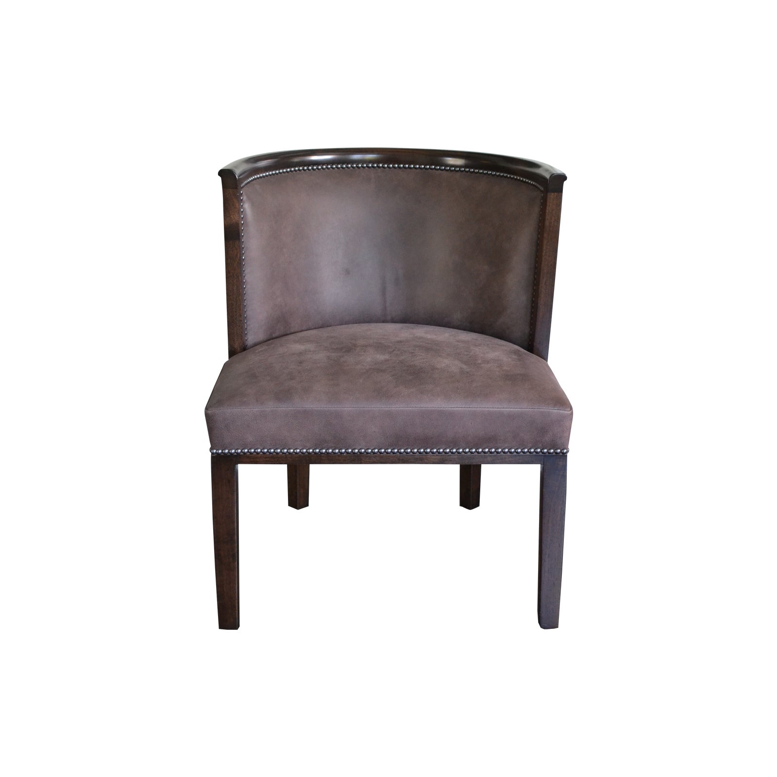
With this foundation, I could pretty much take the design in any direction.
I focused on picking pieces that would bring harmony to the room and tie everything together.
The next piece is the sideboard. I wanted it to coordinate with either the table or the chairs: and I didn't want legs. There are enough differences in legs going on in this room.
This sideboard from Ballard Designs is just the ticket.

The dark colour ties it to the table and its traditional lines and distressed finish tie it to the chairs. The great thing about a piece like this, too, is that if you wanted, you could tie it more strongly to the table by painting it glossy. Knobs in brushed gold or brass would update it instantly, too.
Speaking of gold or brass, I found this fabulous chandelier:

I love all the curves. In a way, the chunky orb relates to the table--but in all other things, this chandy speaks to the chairs.
I was really lucky to find the perfect rug for this room, too. Well, maybe not lucky, exactly. There are so many options on the site.
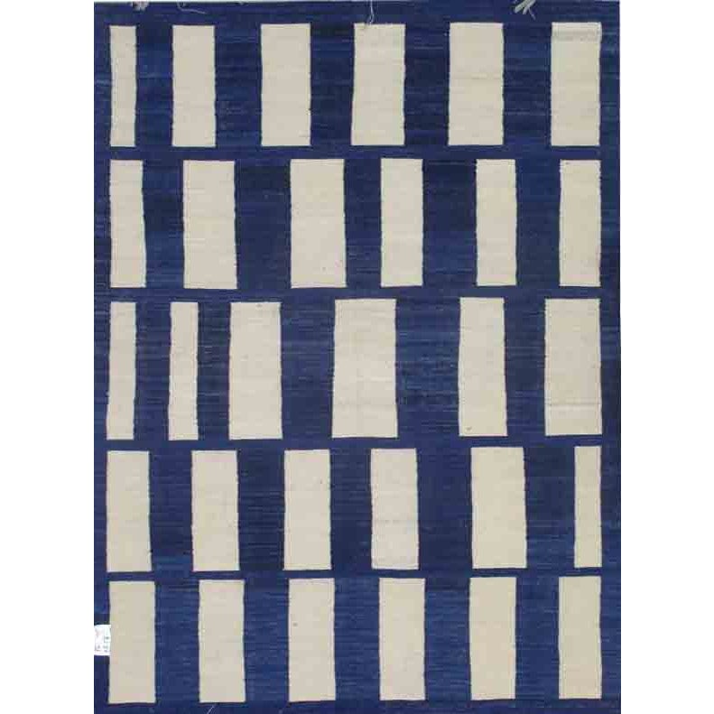
source
Doesn't the pattern remind you of the table?
Now, to round things out, we need some artwork, a lamp and a few accessories for our credenza.
This poster has a fabulous vibe:

(I think the fold line in the poster just adds to the strangeness of her eyes.)
It is a little on the small side at 15 3/4" wide and 23 3/4" tall. I'd put it in a large frame. I thought about choosing a different poster (there are lots to choose from!) but then I'd have to pick a different table and chairs. Not only do the colours in the poster marry the colours of the table and chairs together, but to me, the font speaks to the table and her eyelashes to the caneing in the chairs.
Maybe I am over-thinking this.
It wouldn't be the first time.
This gigntic vintage beautiful lamp would look fantastic beside the poster.
(I love gigantic vintage lamps.)

These 24" vases would be a gorgeous counterpoint on the other side of the poster:

You could easily round out the vignette with pieces from Chairish, build a gallery wall, or even kit it out with china and linens. There are lots of choices.
A couple of notes:
1) There's so much stuff on the website that what I thought would be a quick exercise took days. I loved looking through all the pretty things.
2) Stuff is not cheap. This is not craigslist or kijiji.
3) I loved all the photos of the items. The listing provide you with all sorts of angles. They also include dimensions of the pieces (so grateful for that) and many listings are quite frank about wear and tear.
*I did not receive any compensation for writing this post. I thought it would be a fun challenge and it was.

No comments :
Post a Comment